KttiPay Notifications
KttiPay’s notification experience was fragmented — users missed key updates, and there was no clear communication layer across the app. I led the end-to-end redesign, introducing a unified notification system that connected push, in-app, and email channels to keep users effortlessly informed and engaged.
My role
Product Designer
Timeline
3 months in 2025
My responsibilities
UX strategy
Research
UX/UI design
Stakeholder alignment
User testing
Rollout planning
THE PROBLEM
A lack of communication was costing us trust and transactions
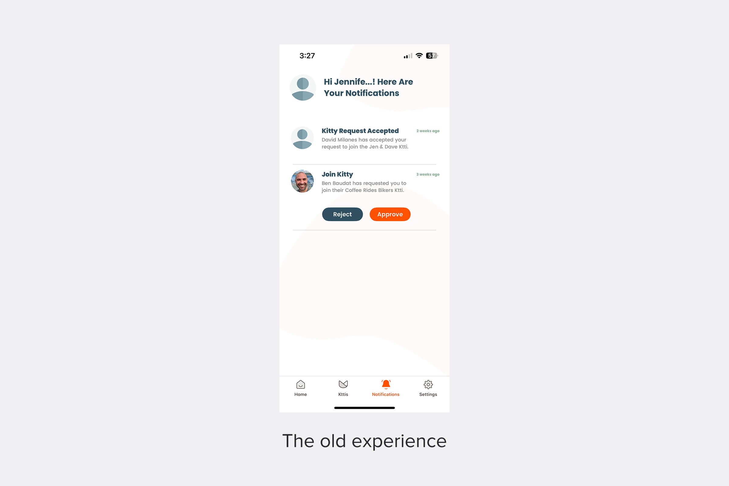
Users had no consistent way of knowing what was happening with their shared funds. They often felt left in the dark when a ktti (our group wallet) was running low or when payments failed because friends hadn’t chipped in. Notifications were almost nonexistent, and the inbox UI made it difficult to spot what actually mattered.
How might we design a notification strategy that not only keeps users informed but also drives business goals — like boosting retention, improving transactions, and encouraging more social sharing?
THE SOLUTION
Turning fragmented touchpoints into a cohesive communication system
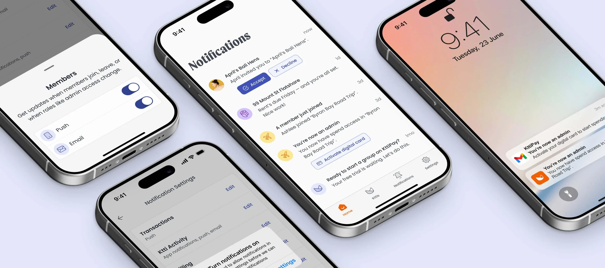
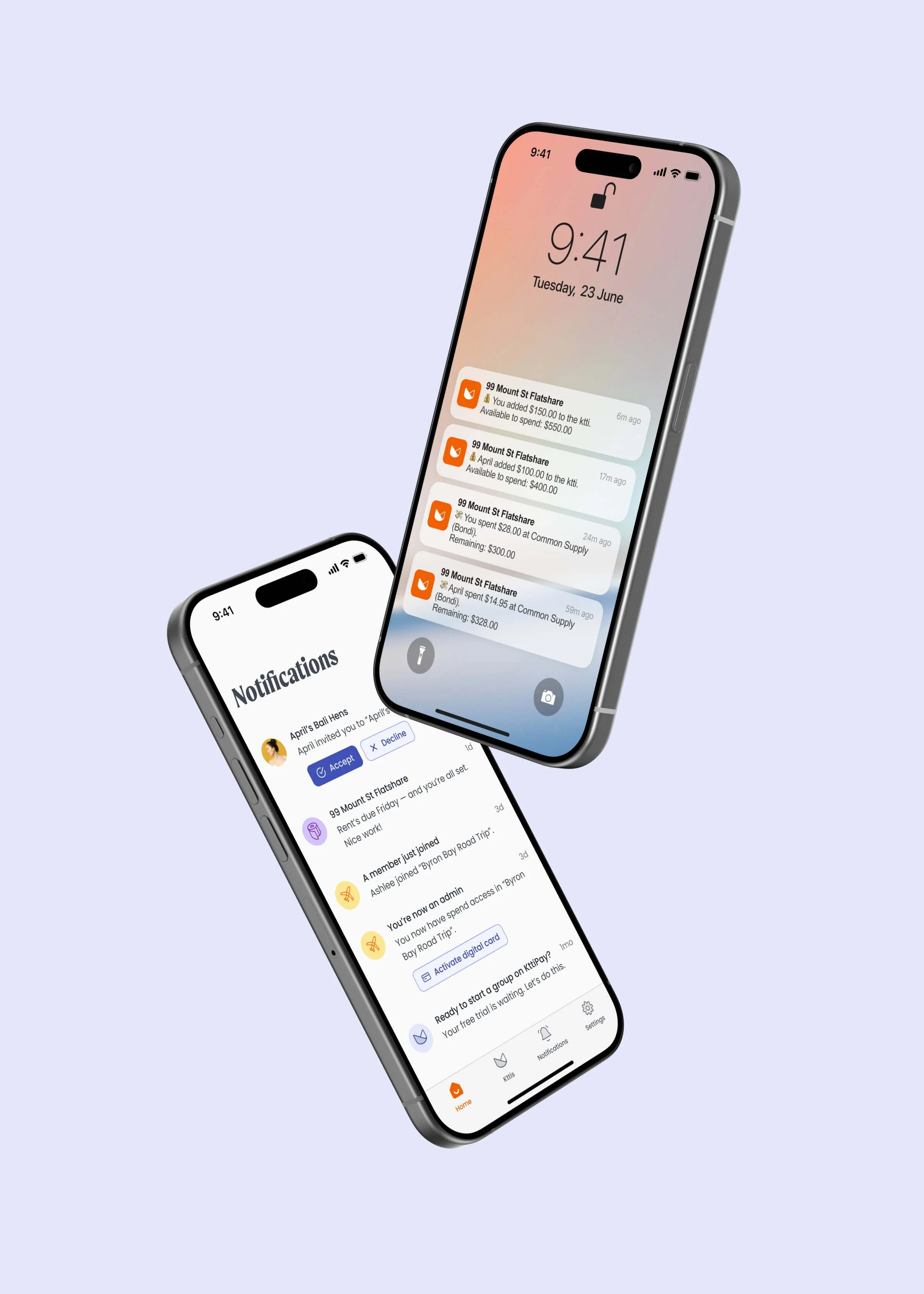
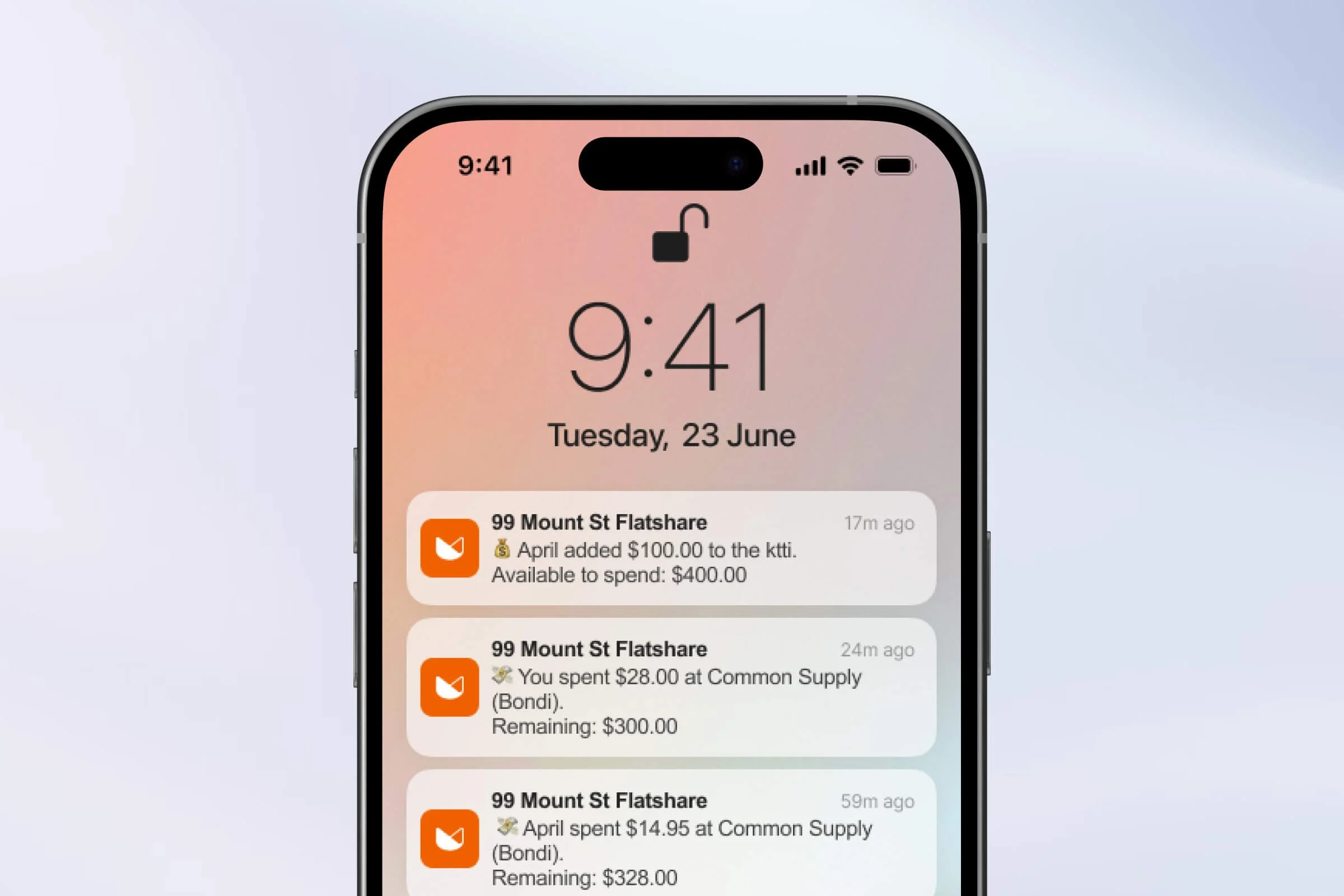
We introduced a holistic notification system that combined real-time push alerts, a redesigned in-app inbox, and targeted lifecycle emails. One simple but impactful change was adding transaction alerts when balances ran low, helping users avoid declined payments and maintain trust in the app.
-
![]()
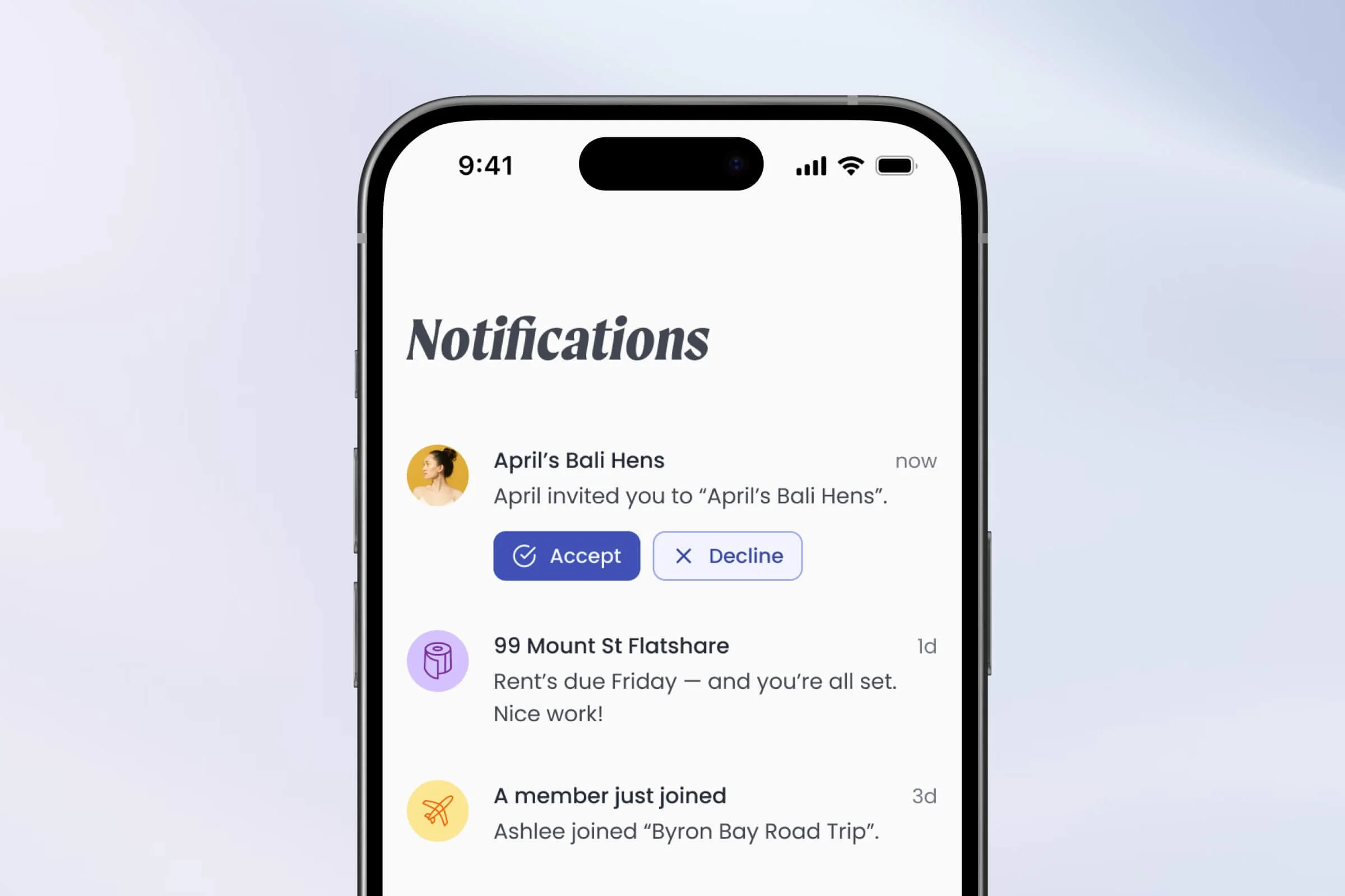
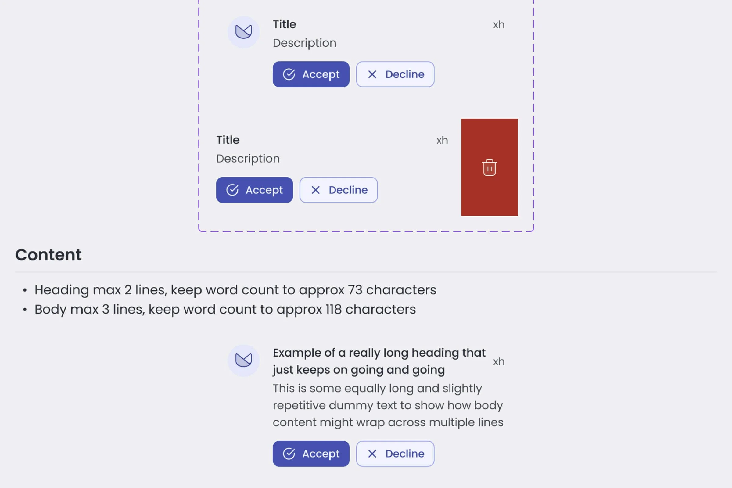
Transaction push alerts
Helping groups stay aligned on shared balances in real time.
-
![]()
Redesigned in-app inbox
A clearer, more visual way to stay across group updates and take action fast.
-
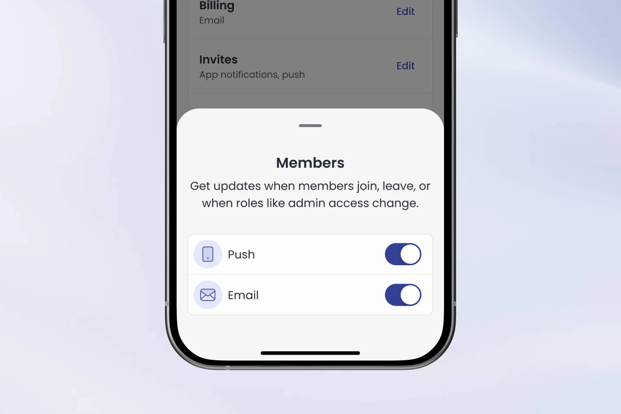
![]()
Customisable notifications
Let users decide what matters — and how they want to hear about it.
THE PROCESS
Discovery and Research
I began by auditing KttiPay’s existing notification ecosystem and aligning with stakeholders on business goals. Through Smartlook and Clevertap analysis, plus 10 user interviews, I identified that users wanted fewer, more relevant notifications and clearer inbox organisation. Competitive benchmarking against Wise, Revolut, and Splitwise helped shape early ideation.
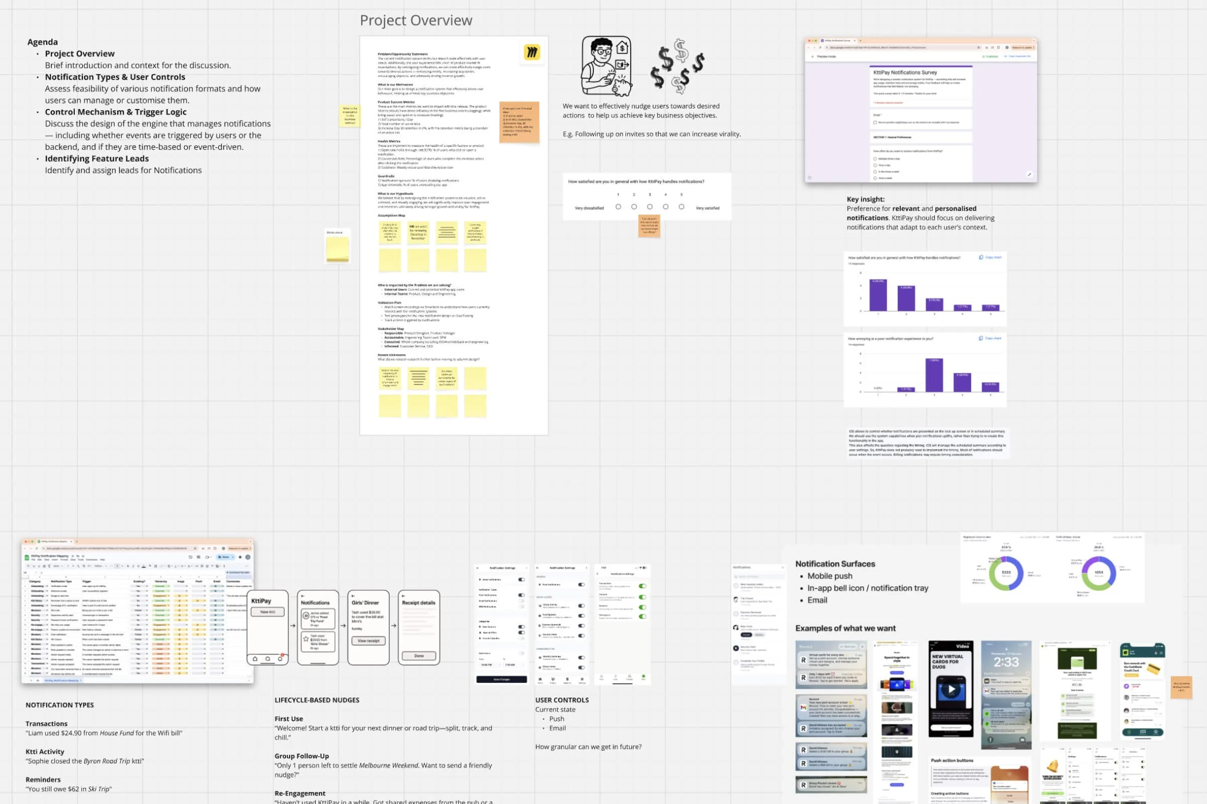
Defining the Strategy
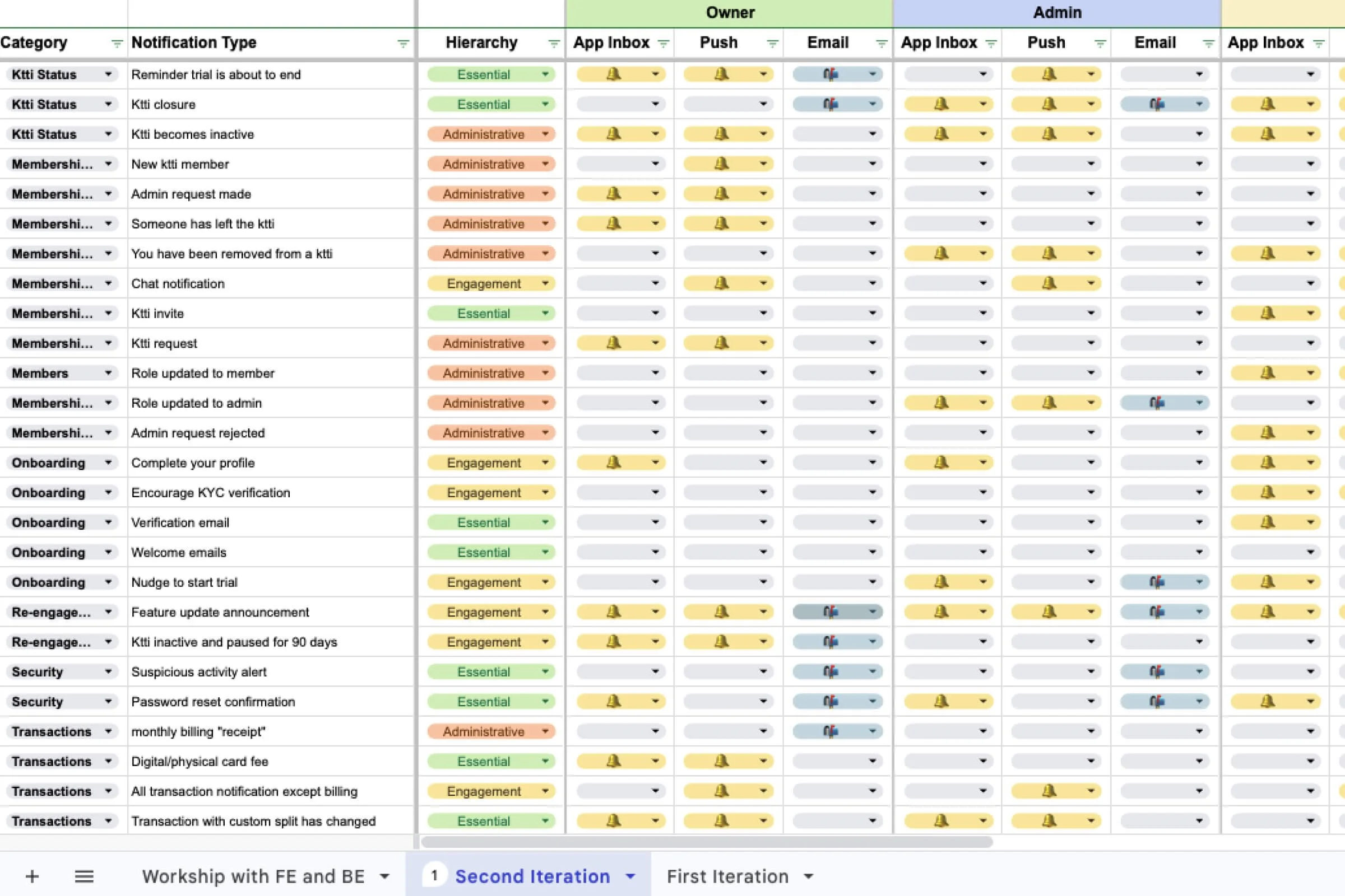
Using a detailed notification mapping exercise, I collaborated with our product manager and engineers to prioritise high-impact notifications and structure a three-phase rollout:
Phase 1: Rebuild existing notifications and fix reliability bugs
Phase 2: Focus on high-impact notifications that drive revenue, acquisition, deposits, virality, and conversion
Phase 3: Introduce engagement notifications that enhance experience
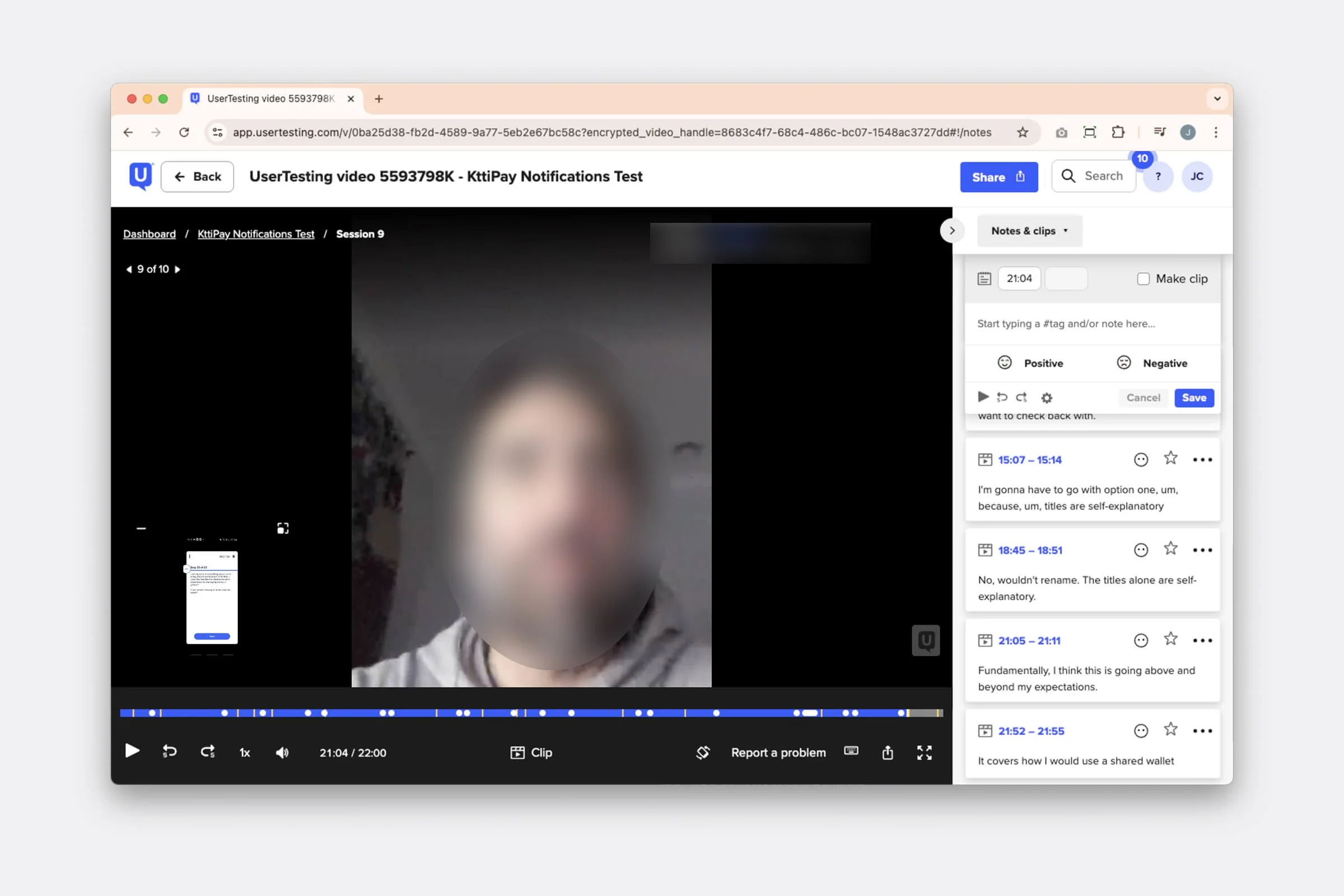
Designing and Testing
I created and tested multiple lo-fi concepts for the inbox and settings experience. User testing revealed clear preferences for colour use, filtering options, and transparency in notification control — all of which informed the final visual and interaction design.
Implementation and Rollout
I partnered with engineering to define a scalable backend structure that was agnostic to the notification engine, ensuring flexibility for growth. Working with marketing, we evaluated tools like Braze and Clevertap, then launched a phased rollout.
THE IMPACT
Turning communication into connection
The new notification system drove measurable gains across key engagement metrics. Daily transactions grew from ~120 to 300 per day (+150%), active users increased from ~90 to 180 per day, and ktti screen views rose by 50%. The strongest impact was seen in the mid-funnel, where better-timed notifications boosted app opens and transaction frequency.
The new notification system has also become the foundation for growth features like money requests and AI-driven notifications
Next case study →