KttiPay Registration Redesign
KttiPay’s onboarding was seeing major user drop-off — out of 30,000 installs, 11,000 users created accounts and 1,250 users completed ID verification. Most never got to experience the product’s core value. My goal was to redesign the registration flow to be frictionless, trustworthy, and clear — enabling more users to activate their accounts and experience more of KttiPay’s value.
My role
Product Designer
Timeline
2 months in 2025
My responsibilities
UX research
Wireframing
Visual and content design
Developer handoff
THE PROBLEM
Low-quality traffic and a high-friction onboarding flow
This wasn’t just a UX problem. It was a combination of unclear intent, early friction, and low trust that caused users to drop-off before verifying their identity. Most users came from performance marketing campaigns that didn’t clearly communicate KttiPay’s value. Complex steps, unclear copy, and early KYC prompts also created cognitive overload and low trust.
How might we design a registration flow that feels effortless and trustworthy?
THE SOLUTION
From a compliance hurdle to a confident first step in the user journey
-
![]()
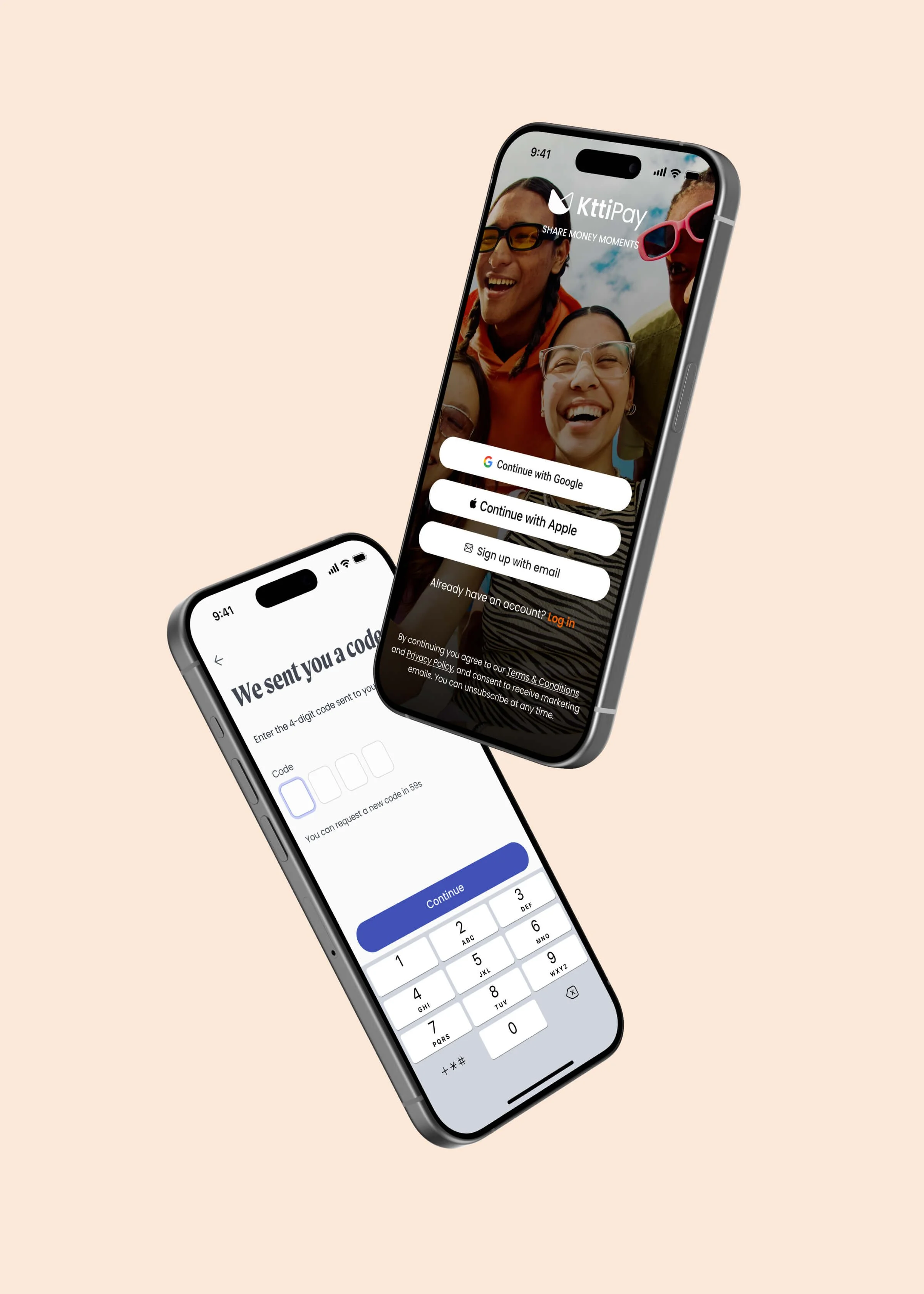
Reframed KYC as protection, not paperwork
Shifted messaging to build trust, reduce friction, and help users understand how verification protects their identity and keeps their money safe.
-
![]()
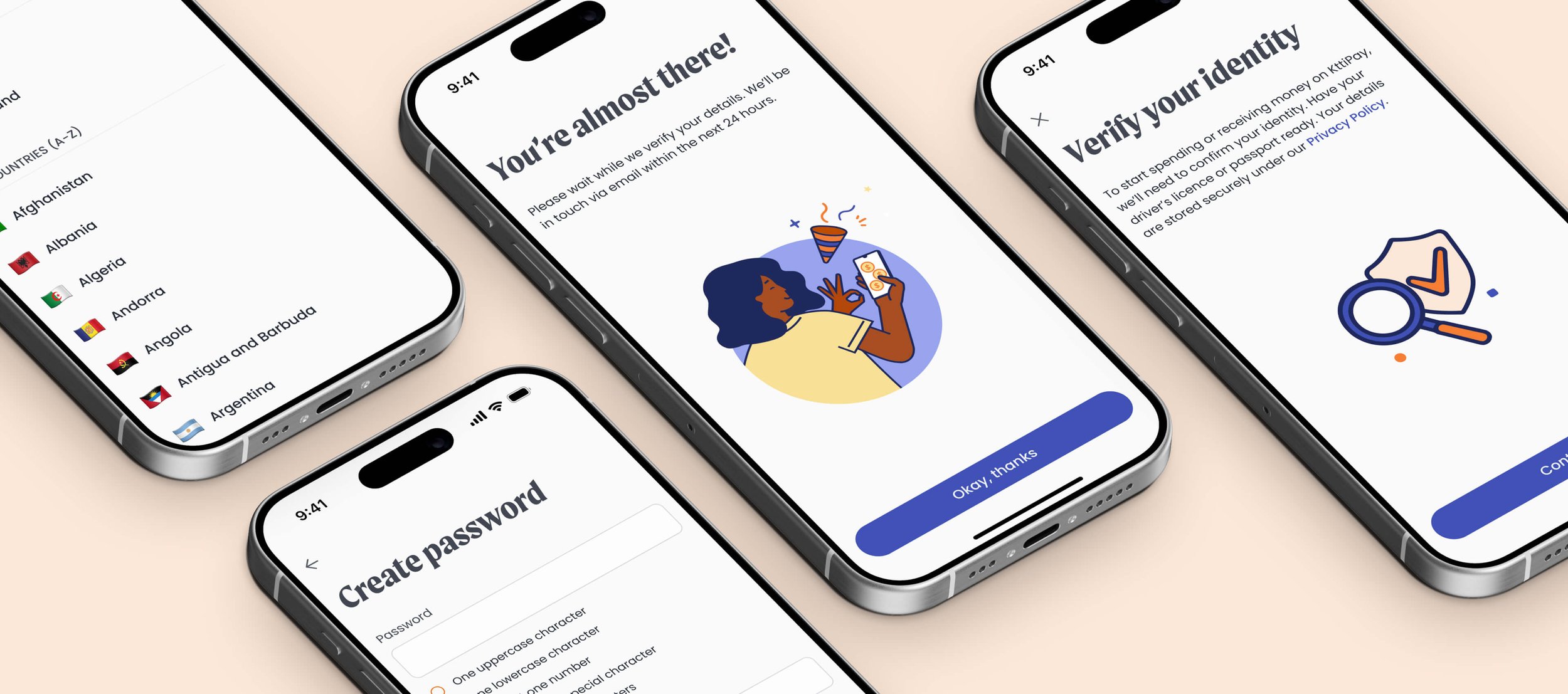
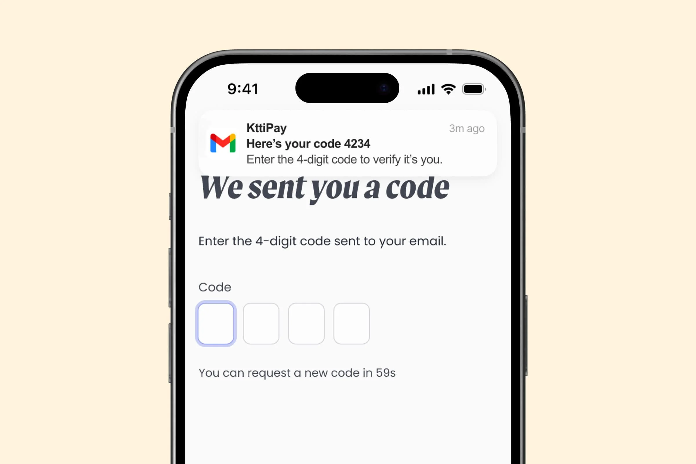
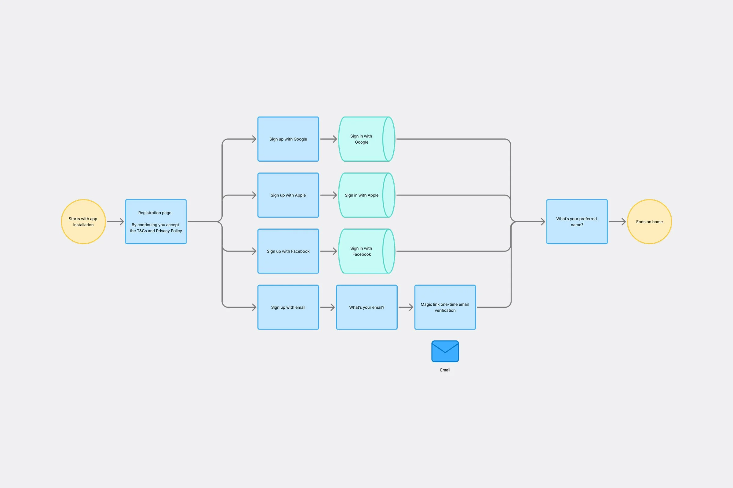
Simplified and deferred verification
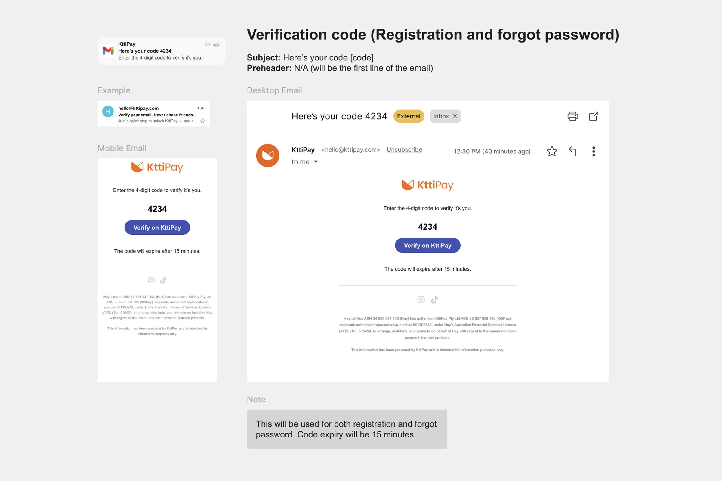
Replaced email verification links with codes to keep users inside the app, and repositioned ID verification later in the flow.
-
![]()
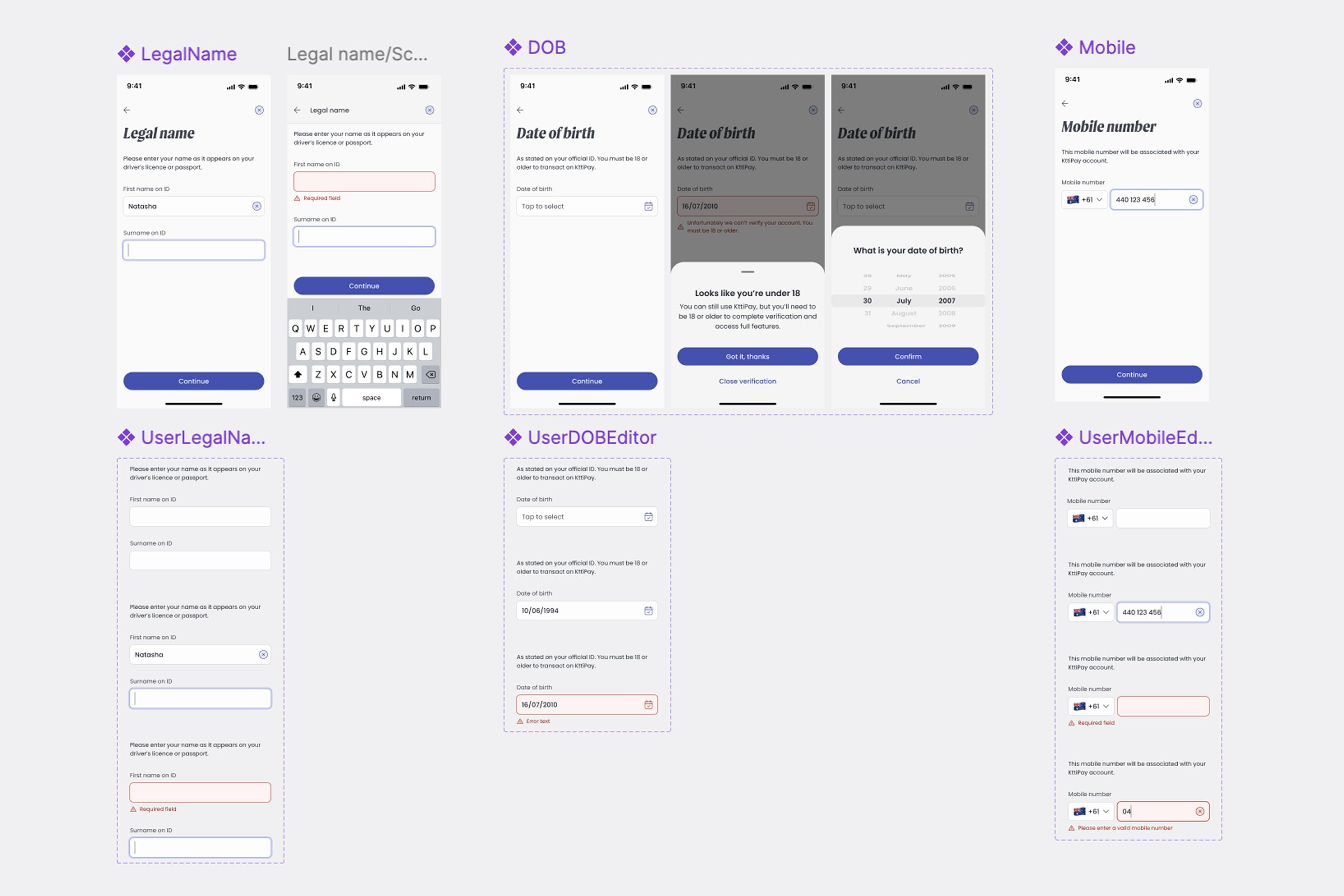
Redesigned for clarity and confidence
Polished visuals, clearer copy, and guided screens reduced cognitive load and built reassurance.


THE PROCESS
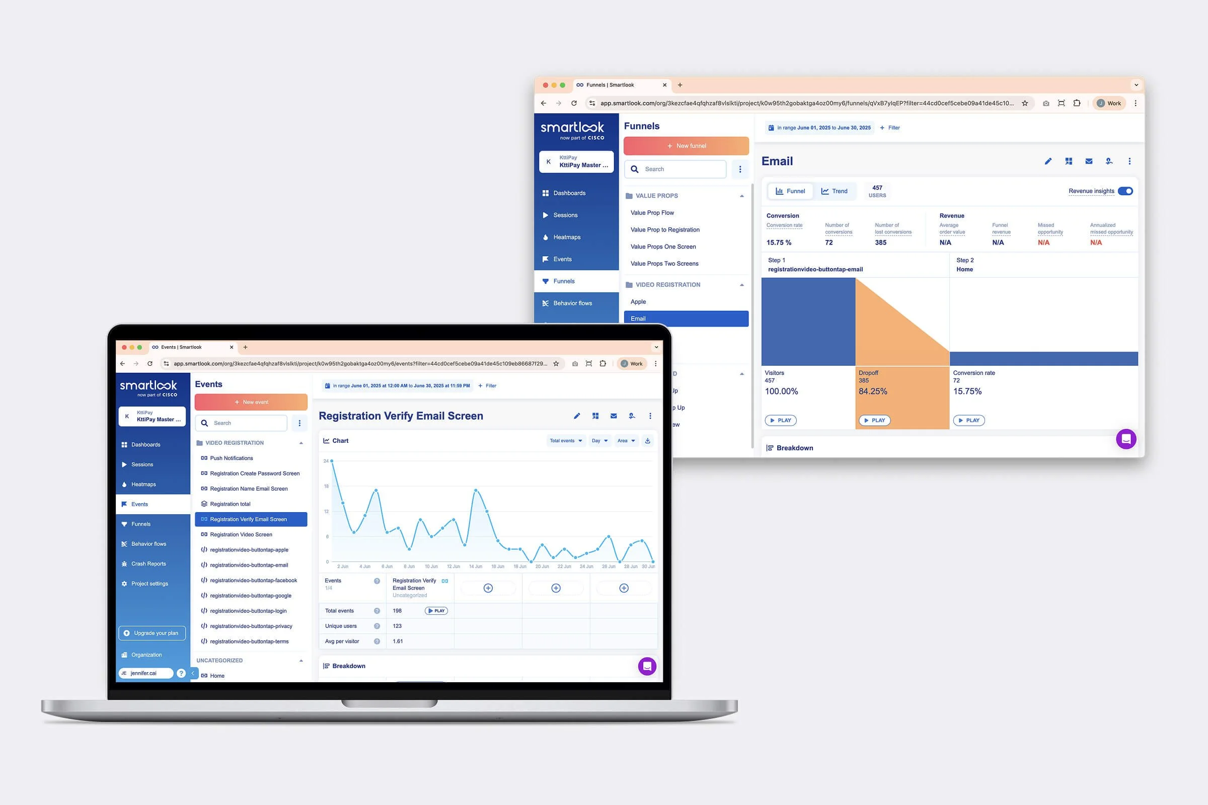
Analysing and aligning
I started by diving into CleverTap and Smartlook analytics to pinpoint where users were dropping off in the funnel. I partnered with engineering early to understand what was technically feasible and worked with the product team to define business goals. This alignment helped to define the scope of the redesign.
Exploration and ideation
I created three lo-fi concept directions for the new flow — one that simplified the existing experience, one that pulled from best-practice fintech benchmarks, and one that reimagined the onboarding journey entirely.
Testing and iterating
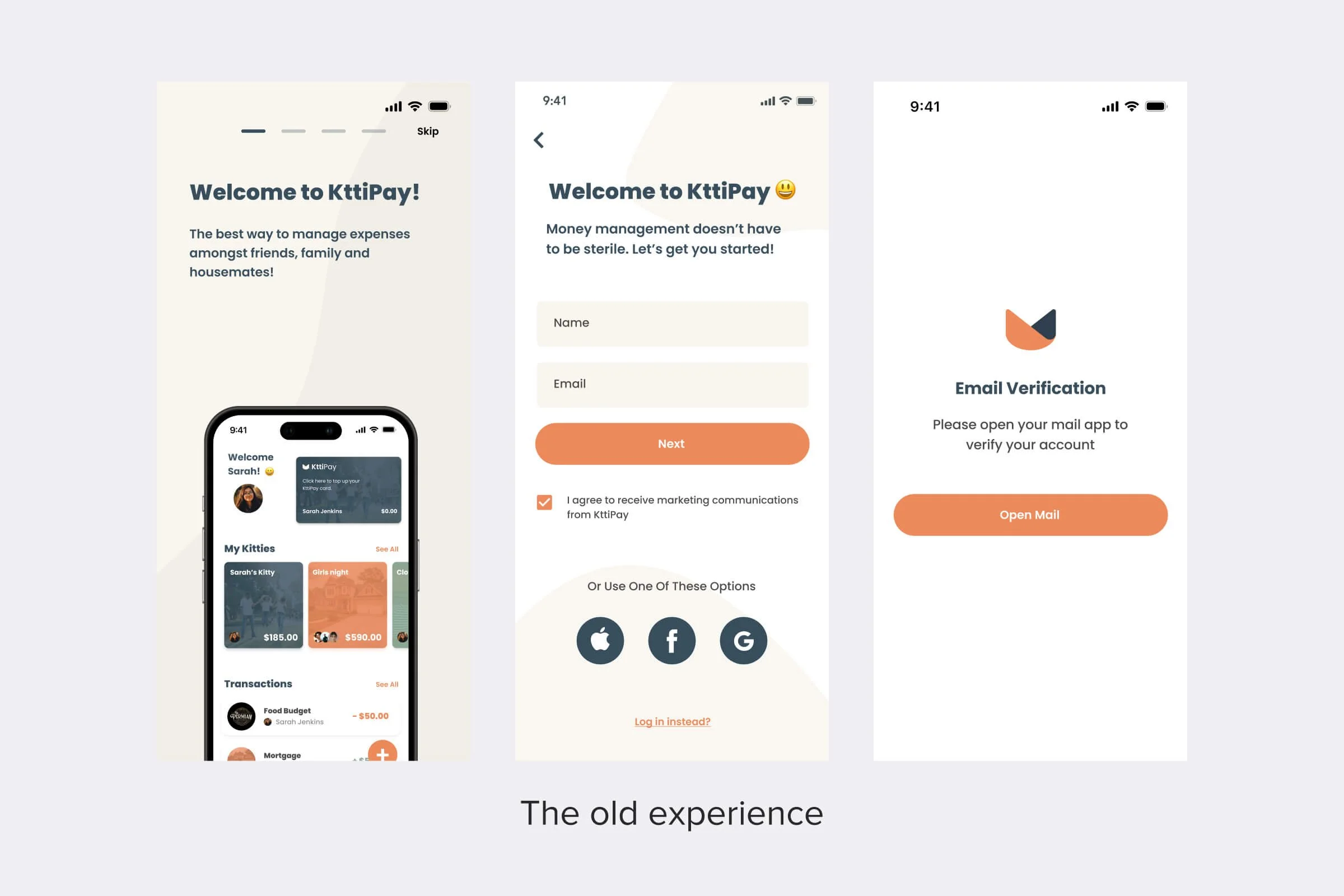
We ran an A/B test of the registration flow. From this, we learned that email links were causing major drop-offs, so I replaced them with a code verification. We also found that Facebook sign-ups were the lowest converting so we dropped this sign up method.
Visual and content design
Once the winning direction was validated, I moved into high-fidelity design. I developed a simplified, trust-first interface — using friendly tone, reassuring visuals, and microcopy that framed verification as a value-add. I ensured that it was consistent with our design system, while also evolving it for more brand credibility.
THE IMPACT
Designing trust that converts
The redesigned registration flow removed friction and lifted key conversion metrics across the funnel. KYC completion jumped from 18% to 65%, aligning with industry standards. Switching from an email link verification to a code verification cut drop-off from 70% to 20%, and email sign-ups completing account creation rose from 7% to 40%. Together, these changes created a smoother onboarding experience that set a stronger foundation for activation and retention.
Next case study →