Otaro (AIBUILD)
Otaro is an education platform that uses artificial intelligence (AI), augmented reality (AR) and virtual reality (VR). With Otaro, Educators can create immersive, interactive learning experiences that increase student engagement. It is a project by AIBUILD, a Melbourne-based artificial intelligence company.
I led the team with branding guidelines and UI design.
Project Objectives
Evaluate the quiz and questionnaire creator
Conduct usability testing with Educators and gather feedback to refine the design
Create a UX report and UI branding guidelines
Timeline , Team & TOOLS
Four weeks
Eight team members
Figma, FigJam, Slack, Zoom
My Role
UX Research, UX Design, UI Design

THE PROBLEM
The AI-volution of Learning
With traditional teaching methods, Educators are limited by how they can improve the learning experience. Otaro brings innovation to the education industry by using emerging technologies to create an immersive learning platform. Their quizzes and questionnaires integrate augmented reality (AR) and virtual reality (VR), fostering an interactive class environment.
They enlisted our help to evaluate the platform and gather feedback from Educators to refine the product. They also wanted to understand their brand perception and formalise their design systems with a UI branding guideline.
How might we enhance the platform for Educators to create, preview and publish their quizzes and questionnaires more efficiently?
THE SOLUTION
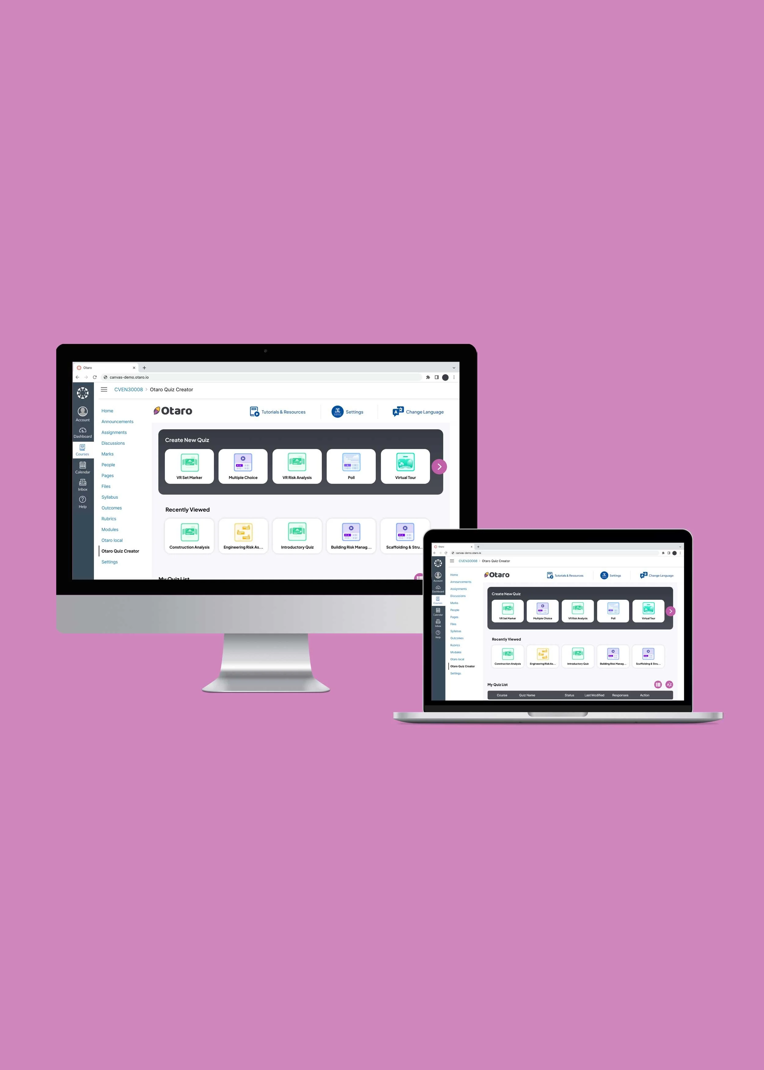
dashboard to success
A key discovery from the user research and usability testing was that the overall navigation needed improvement. The main dashboard and two question formats were re-designed as priority revisions. It involved changing the layout and copy to make the platform more intuitive. Feedback about the UI was positive, so we focused on evolving instead of reinventing the Otaro brand.
THE PROCESS
DISCOVER
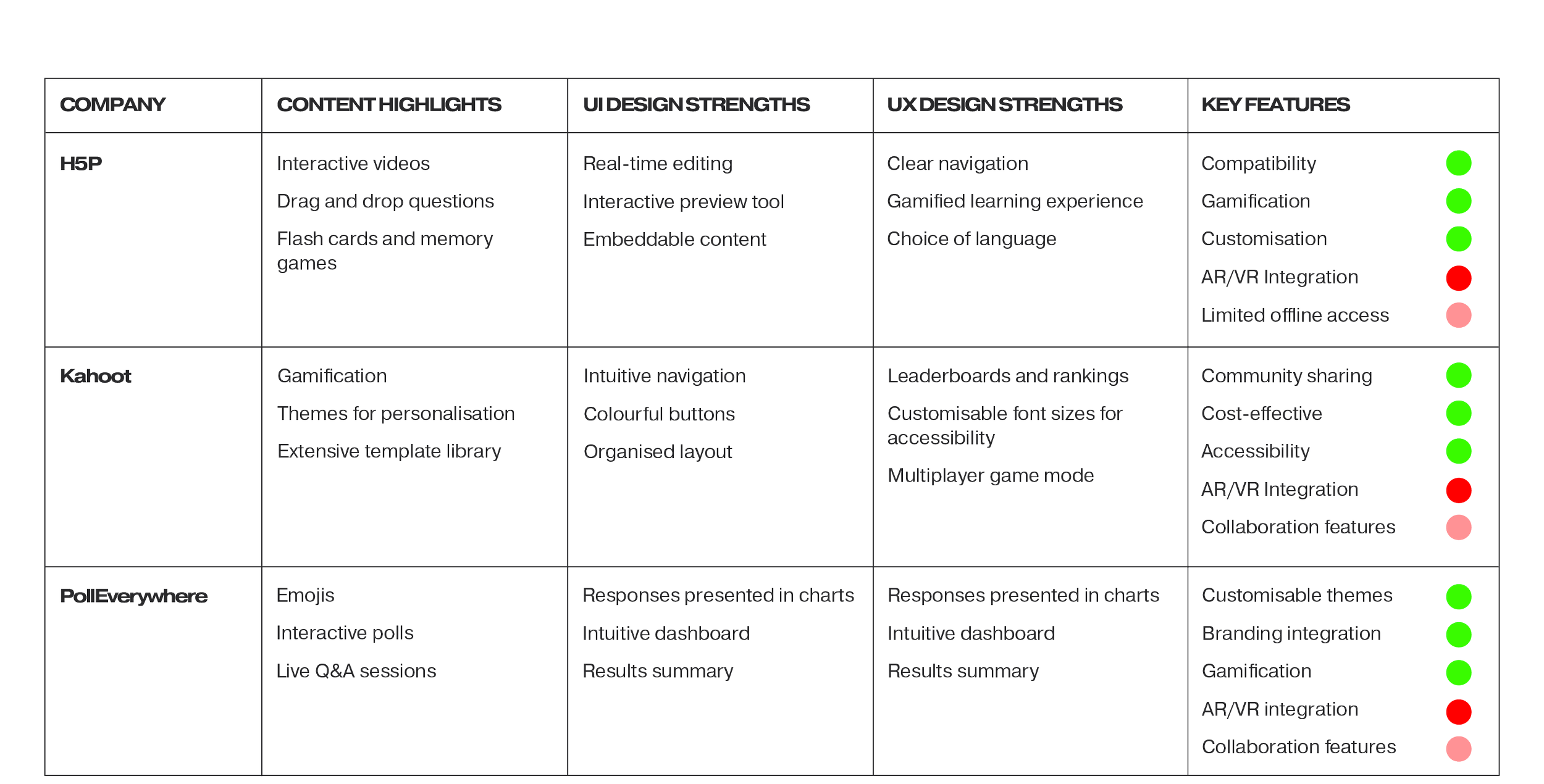
Competitor Analysis
The research team did an analysis of the following companies that Otaro identified as competitors:
H5P
Kahoot
PollEverywhere
They all lacked AR/VR integration, making this a competitive advantage for Otaro.
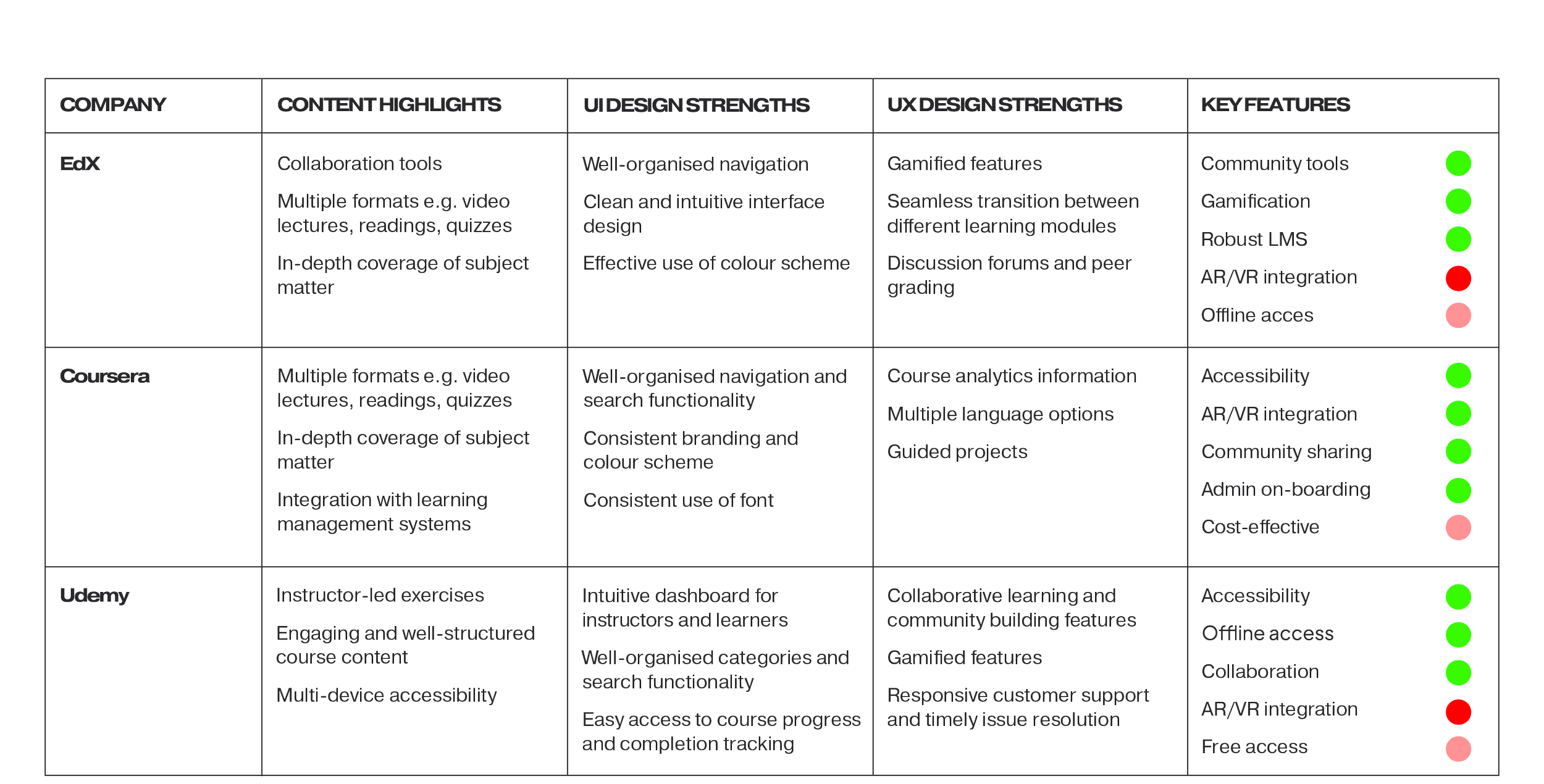
Desktop Research
In our desktop research, the research team also looked at the following adjacent education platforms:
EdX
Coursera
Udemy
Coursera stood out as the only platform utilising AR/VR integration effectively.
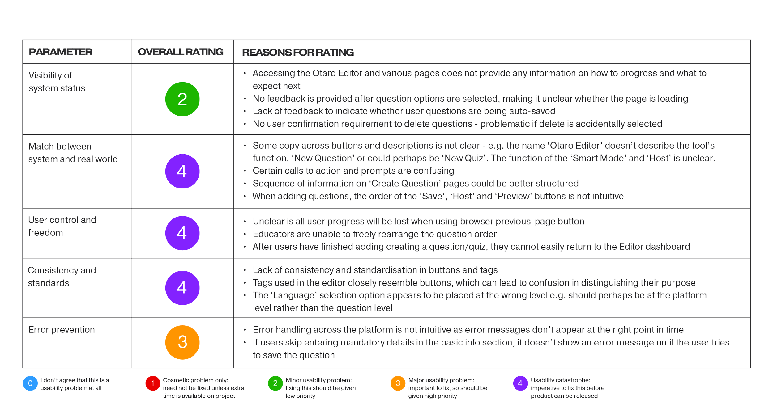
Heuristic Evaluation
A heuristic evaluation of Otaro's original platform revealed the following areas that required improvement:
Match between systems and real world
User control and freedom
Consistency and standards
The exercise helped with the prioritisation of our design solutions.
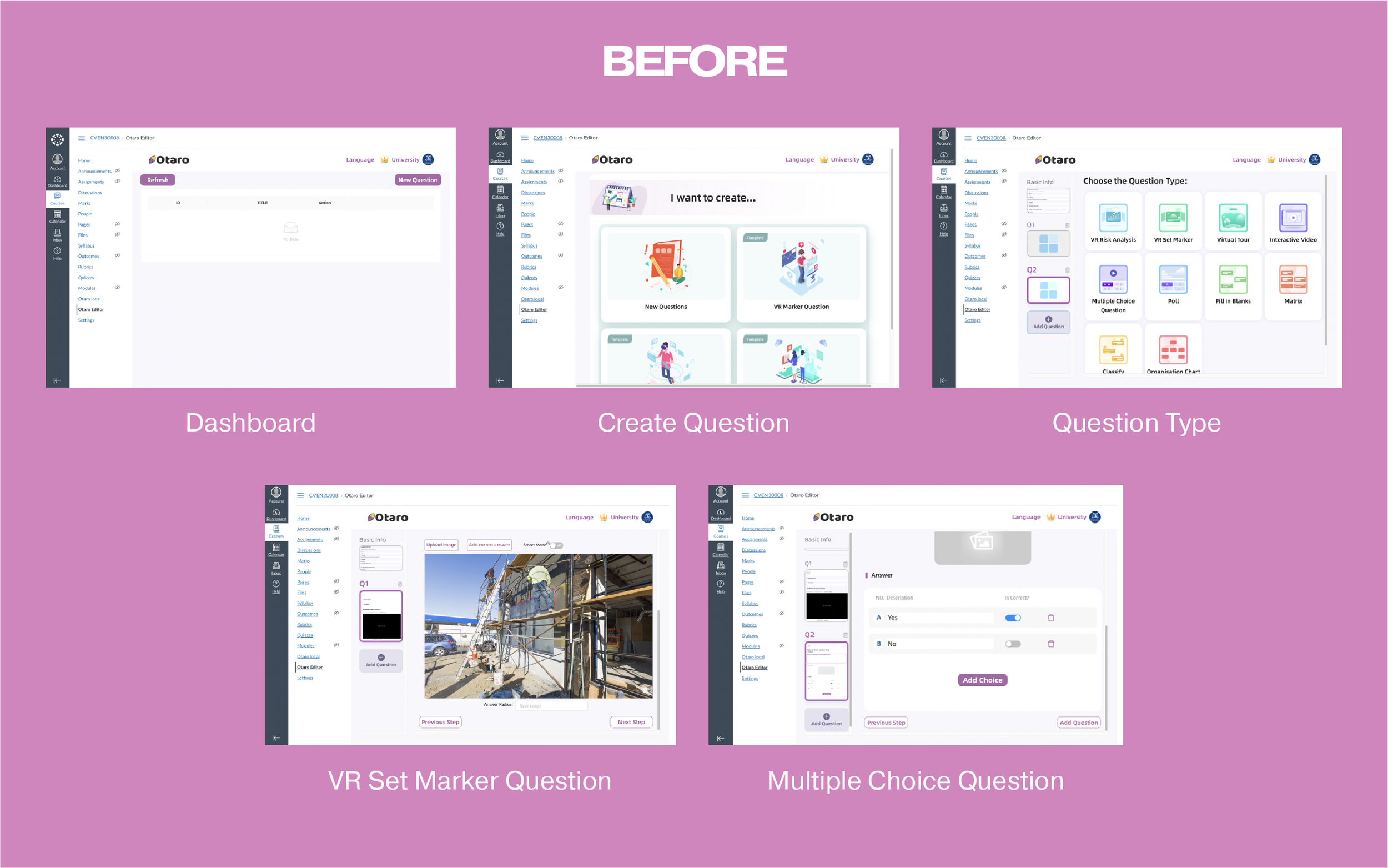
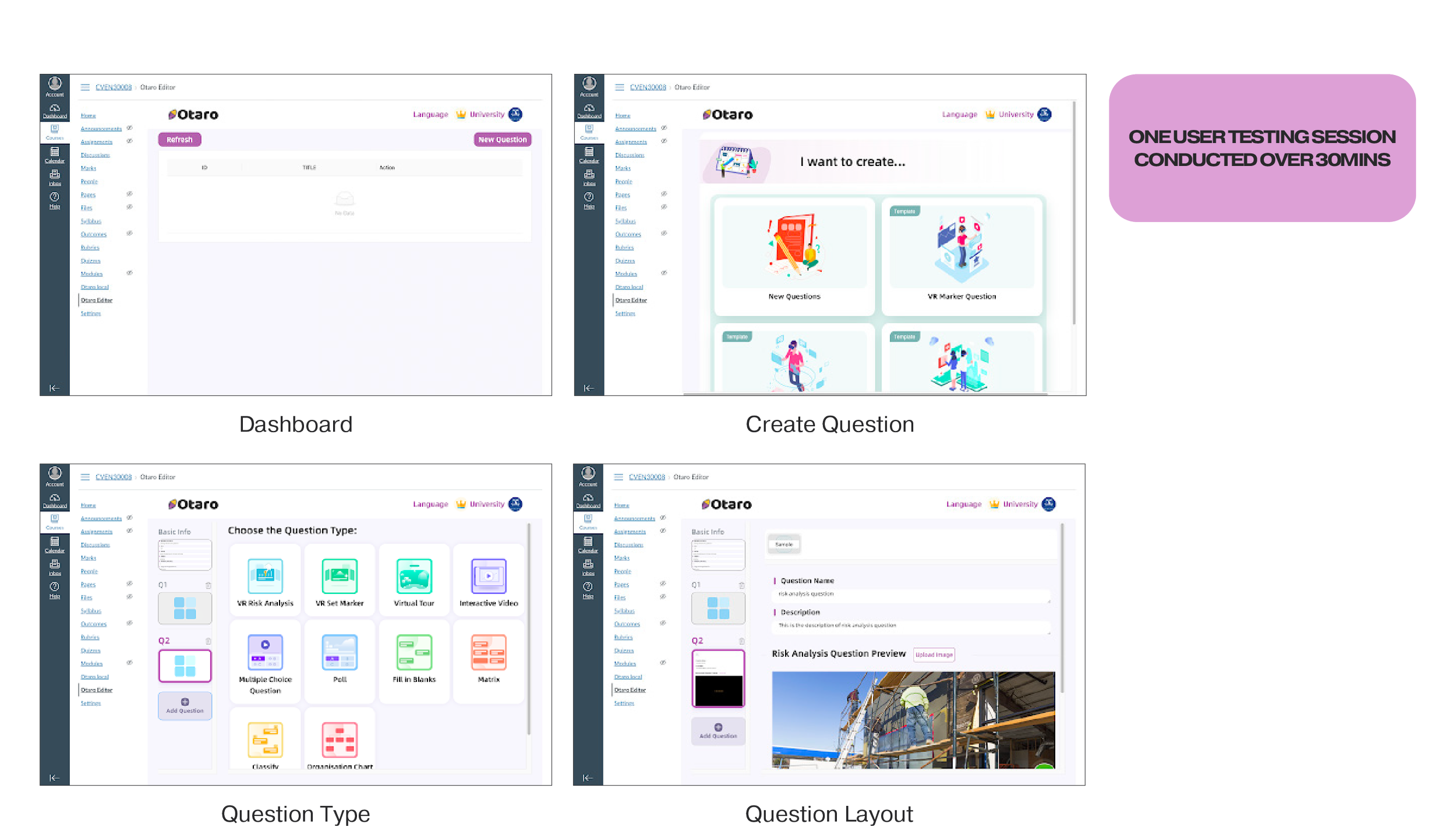
User Testing (original platform)
I conducted a user testing session with a university lecturer, asking the participant to 'Think Aloud' as they navigated the platform. The participant was also assigned two specific tasks: creating a poll and a VR question.
Positive feedback from the user included:
Appreciation for the platform's design, as it closely resembled Canvas, another Learning Management System (LMS)
Positive impressions of the colourful graphics
Favourable remarks about the variety of question styles
Recognition of the integration of VR as a valuable feature
However, the user encountered several pain points, including:
Confusion when transitioning from the dashboard to the question creation interface
Confusion related to specific question fields, headings, prompts, and calls-to-action
A lack of guidance or onboarding for first-time users unfamiliar with the platform
Uncertainty about how to publish or save the quiz
Ambiguity regarding whether quiz progress was being automatically saved
DEFINE
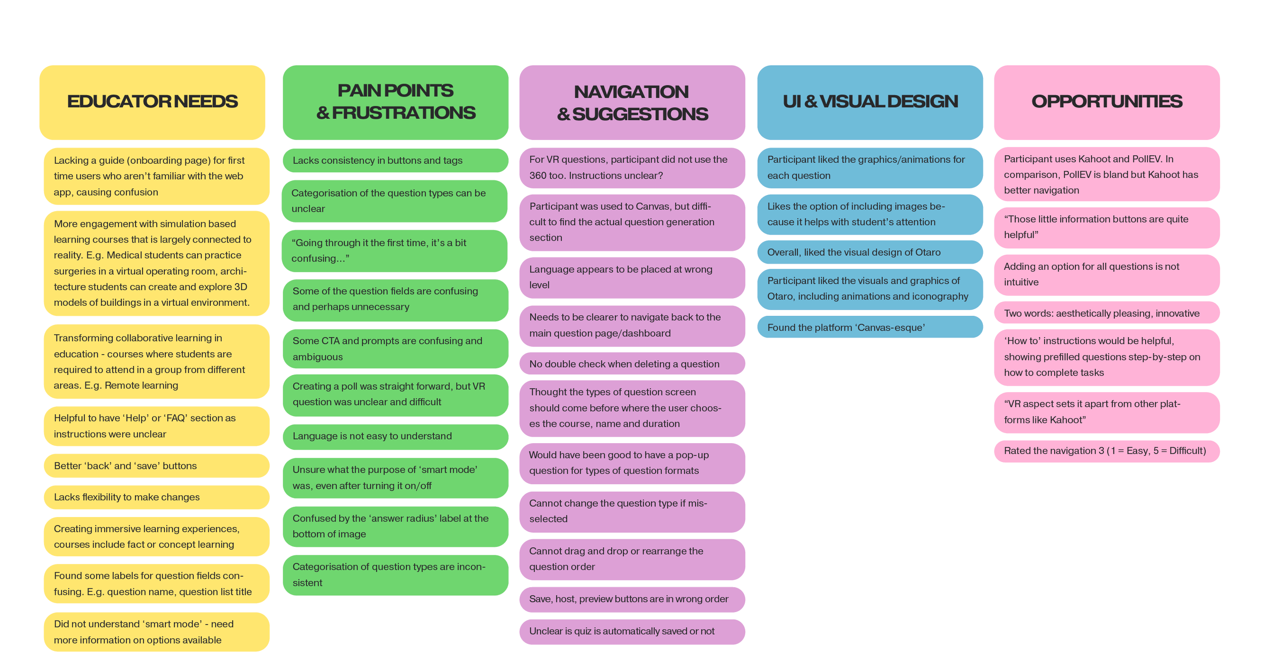
AFFINITY MAP
Based on user research, an affinity map was created, and the findings were categorized as follows.
Educator needs
Pain points and frustrations
Navigation and suggestions
UI and visual design
Opportunities
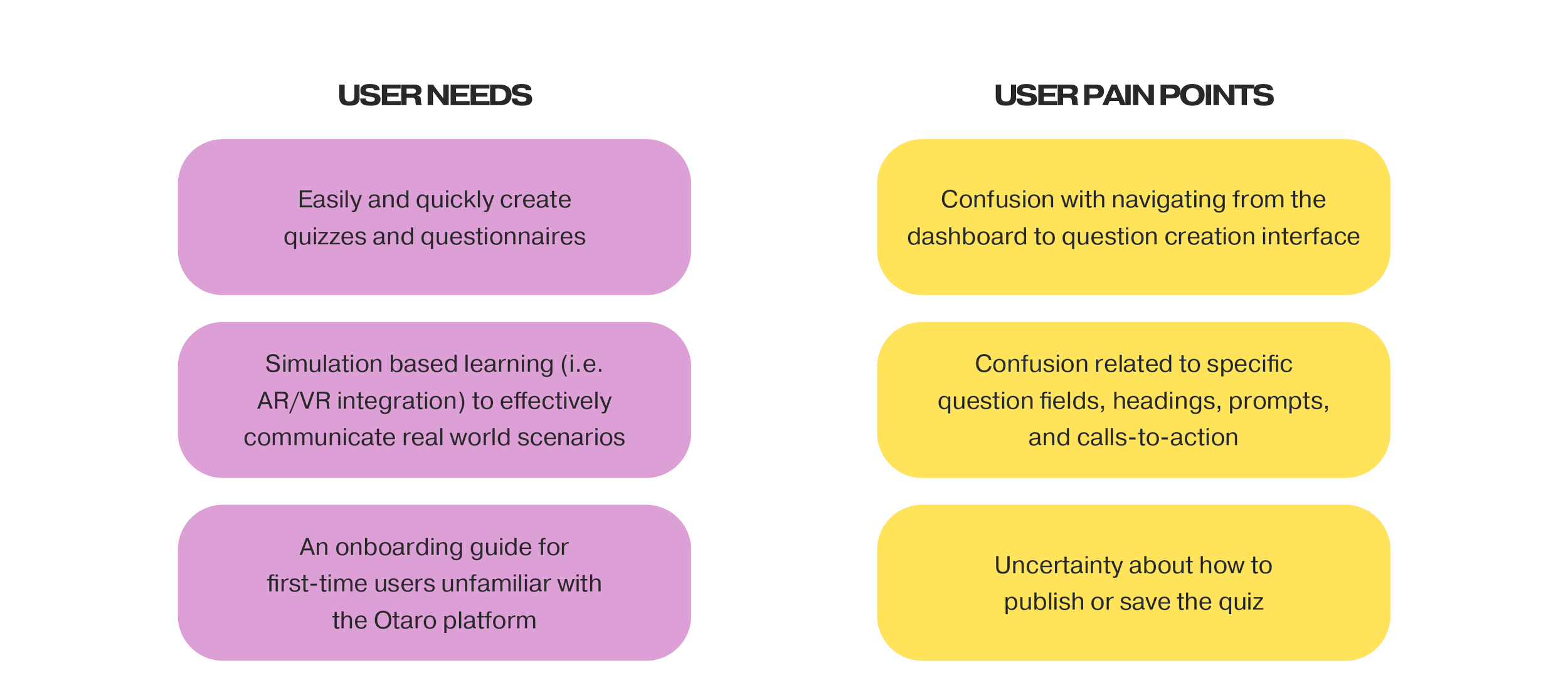
USER NEEDS & PAIN POINTS
User Needs
Easily and quickly create quizzes and questionnaires
AR/VR integration for simulation-based learning to effectively communicate real-world scenarios
An onboarding guide for first-time users unfamiliar with the Otaro platform
User Pain Points
Confusion with navigating from the dashboard to the question creation interface
Confusion related to specific question fields, headings, prompts, and calls-to-action
Uncertainty about how to publish or save the quiz
DEVELOP
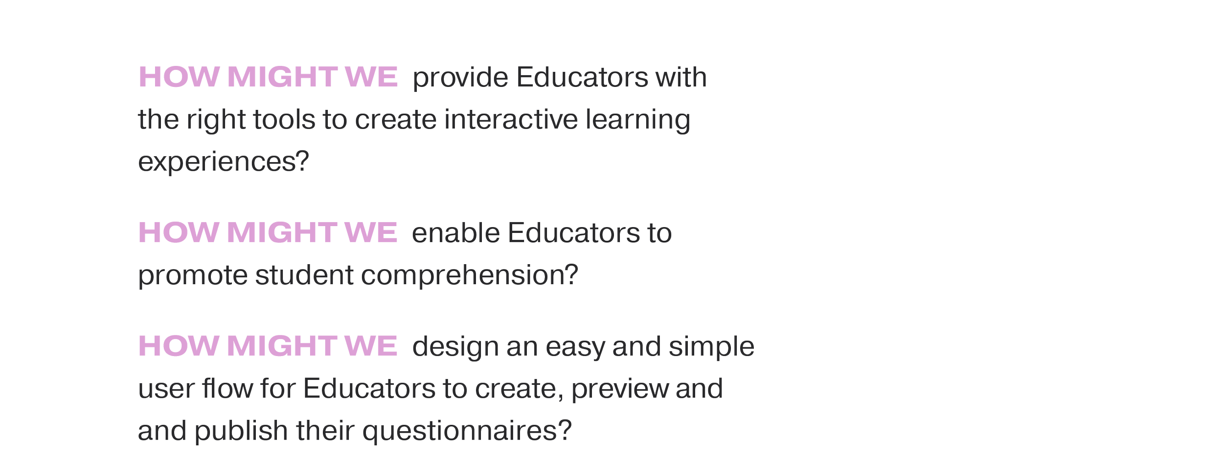
HOW MIGHT WE?
How Might We (HMW) statements were developed to foster creative thinking and brainstorming.
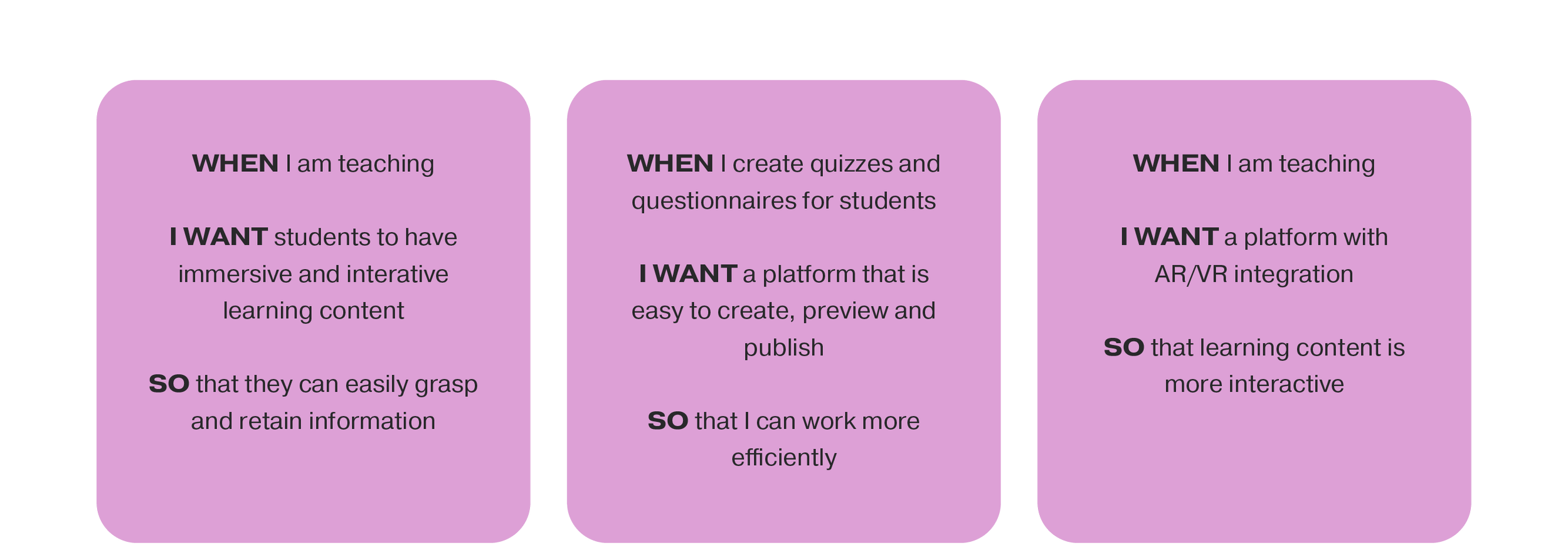
JOBS-TO-BE-DONE
The Jobs-to-be-Done (JTBD) framework was employed to gain a deeper understanding of what the user is striving to achieve. In this context, the term "job" denotes the underlying goal and motivation of a task.
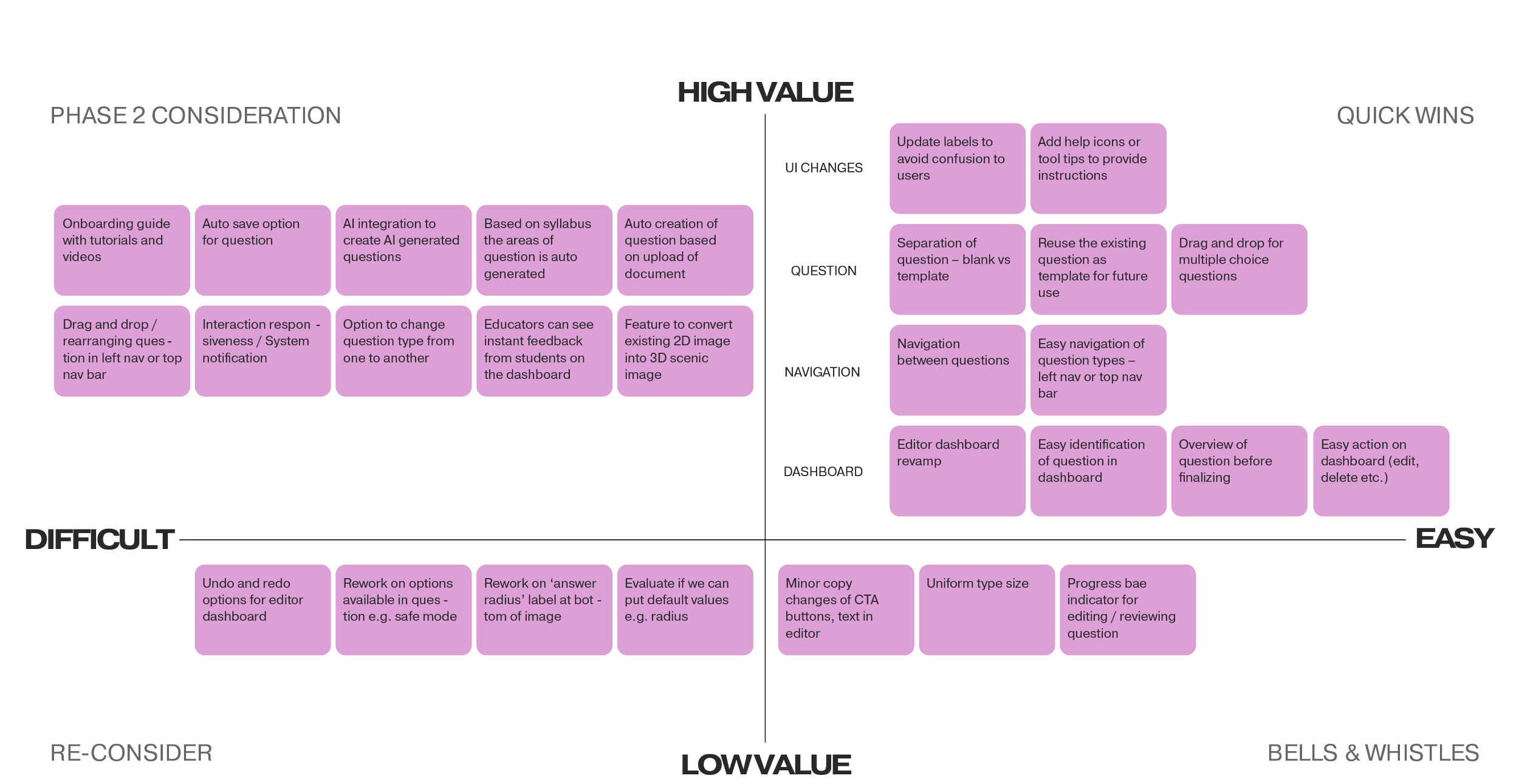
PRIORITISATION MATRIX
After brainstorming design solutions, ideas were organised on a prioritisation matrix along high-to-low value and difficult-to-easy axis points. The quick wins in the high-value and easy quadrant were mainly around the navigation and UI changes.
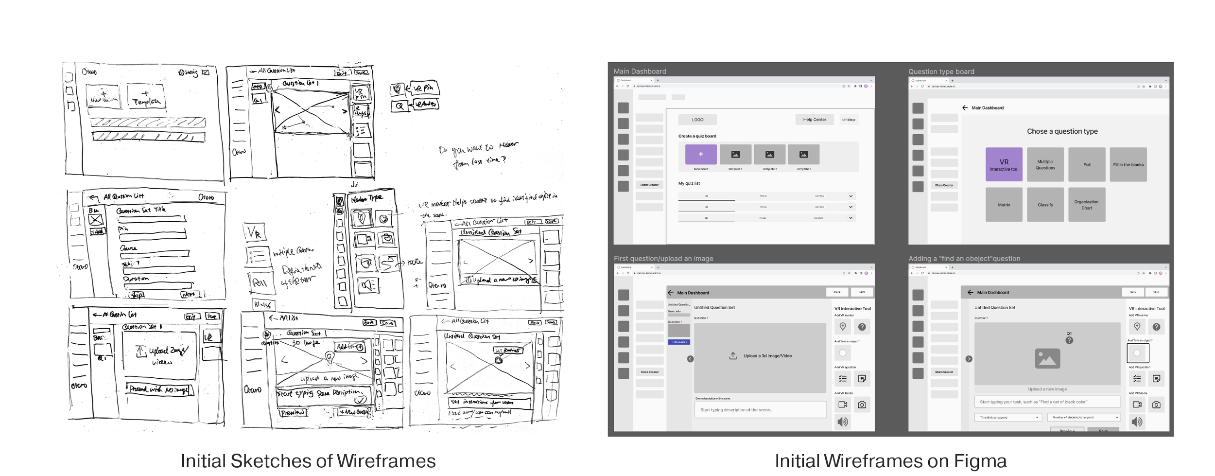
WIREFRAMES
During the ideation phase, team members approached the platform re-design from various angles, bringing different perspectives to the table. Low-fidelity wireframes were then merged and fine-tuned in a collaborative workshop, laying the groundwork for what would eventually evolve into the high-fidelity prototype.
I made the suggestion of having both the list and thumbnail view on the main dashboard.
DELIVER
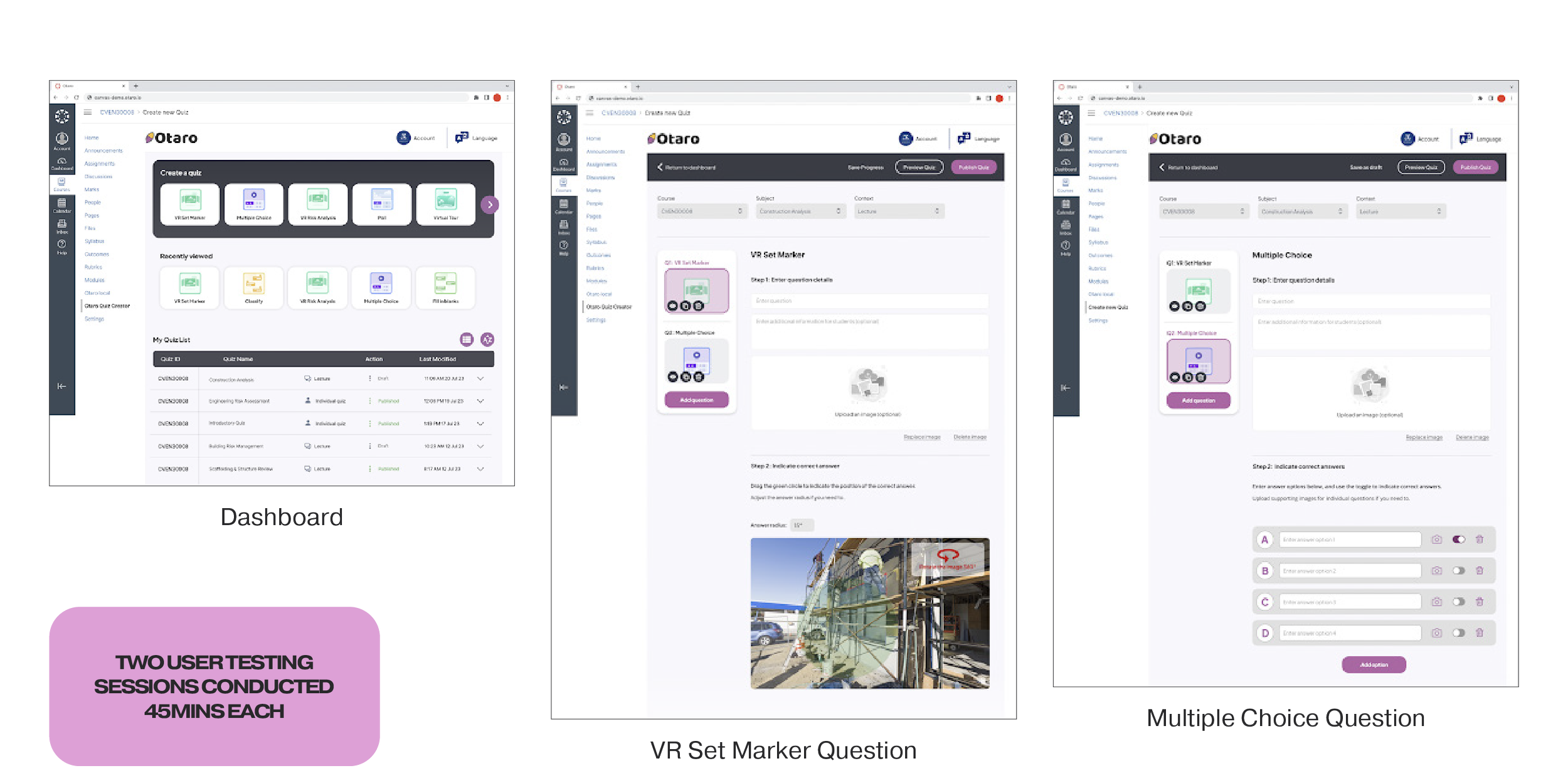
USER TESTING (HIGH-FIDELITY PROTOTYPE)
Educators with experience using quiz-creation platforms participated in user testing sessions, where they interacted with the high-fidelity prototype while receiving prompts and tasks.
What users found particularly appealing in the high-fidelity prototype included:
A summary-style dashboard providing quick access to create a new quiz, recently viewed quizzes and a quiz list
Clear ‘Preview Quiz’ and ‘Publish Quiz’ buttons at the top right-hand corner
Basic course info at the top of the quiz page
Numbered instructions for quiz inputs i.e. ‘Step 1 & Step 2’
The option to upload images for individual answer choices in multiple-choice questions
The ability to ‘hide/show’ and duplicate specific questions within a quiz
Users also provided valuable suggestions for enhancing the platform:
Removing repetitive instances of ‘Account’ in both the left navigation bar and top navigation bar
Implementing a ‘Save Progress’ button accompanied by a loading animation to indicate auto-saving
Adding a ‘Preview’ button to enable users to review individual questions
Allowing users to resize the green circle on VR set marker questions through dragging instead of manual entry of a radius value.
Incorporating a page of FAQs or ‘Tutorials & Resources’ to provide additional examples and guidance
Enabling the drag-and-drop feature for images into the ‘Upload Question’ box
Making quiz statistics visible in the ‘My Quiz List’ section.
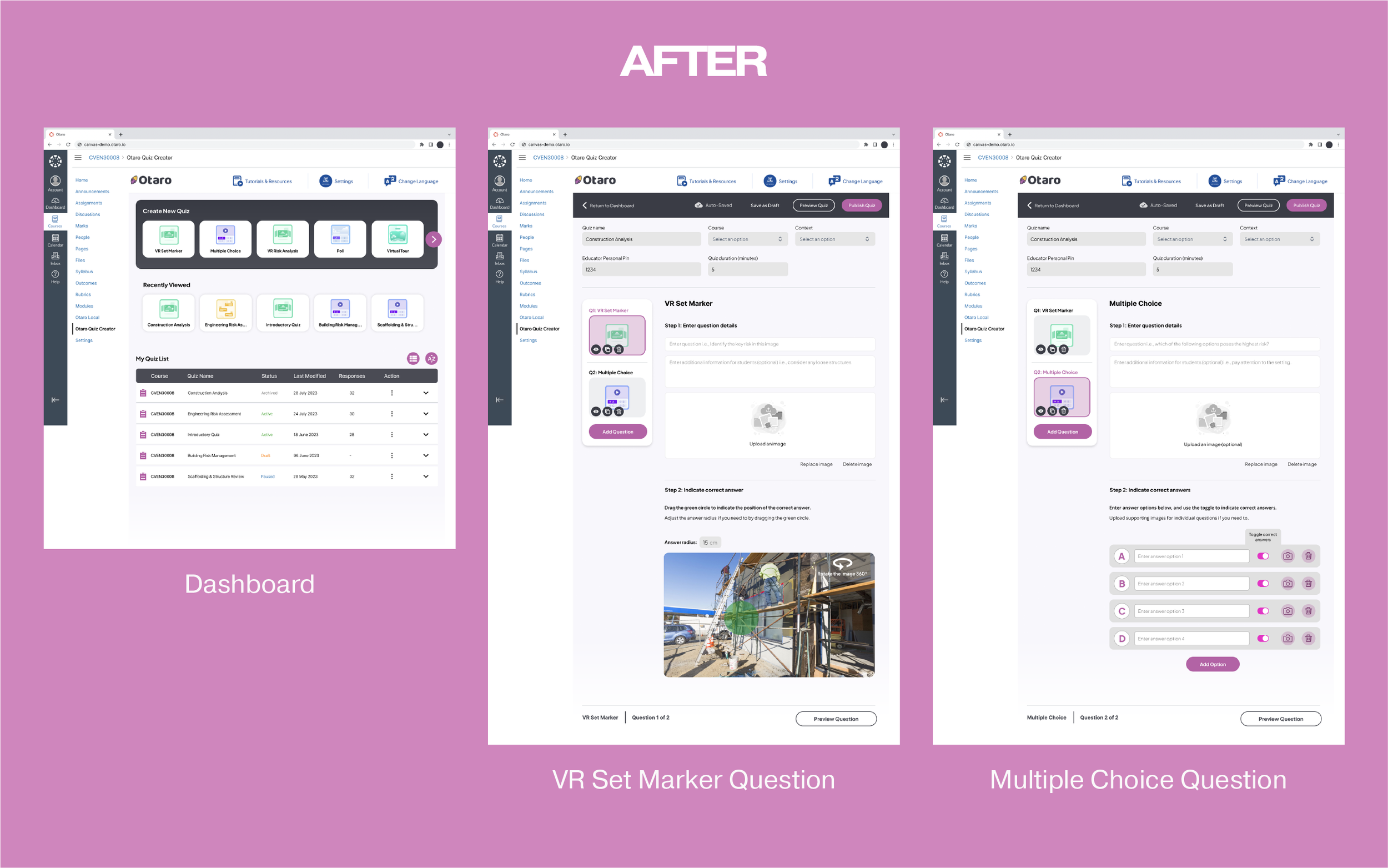
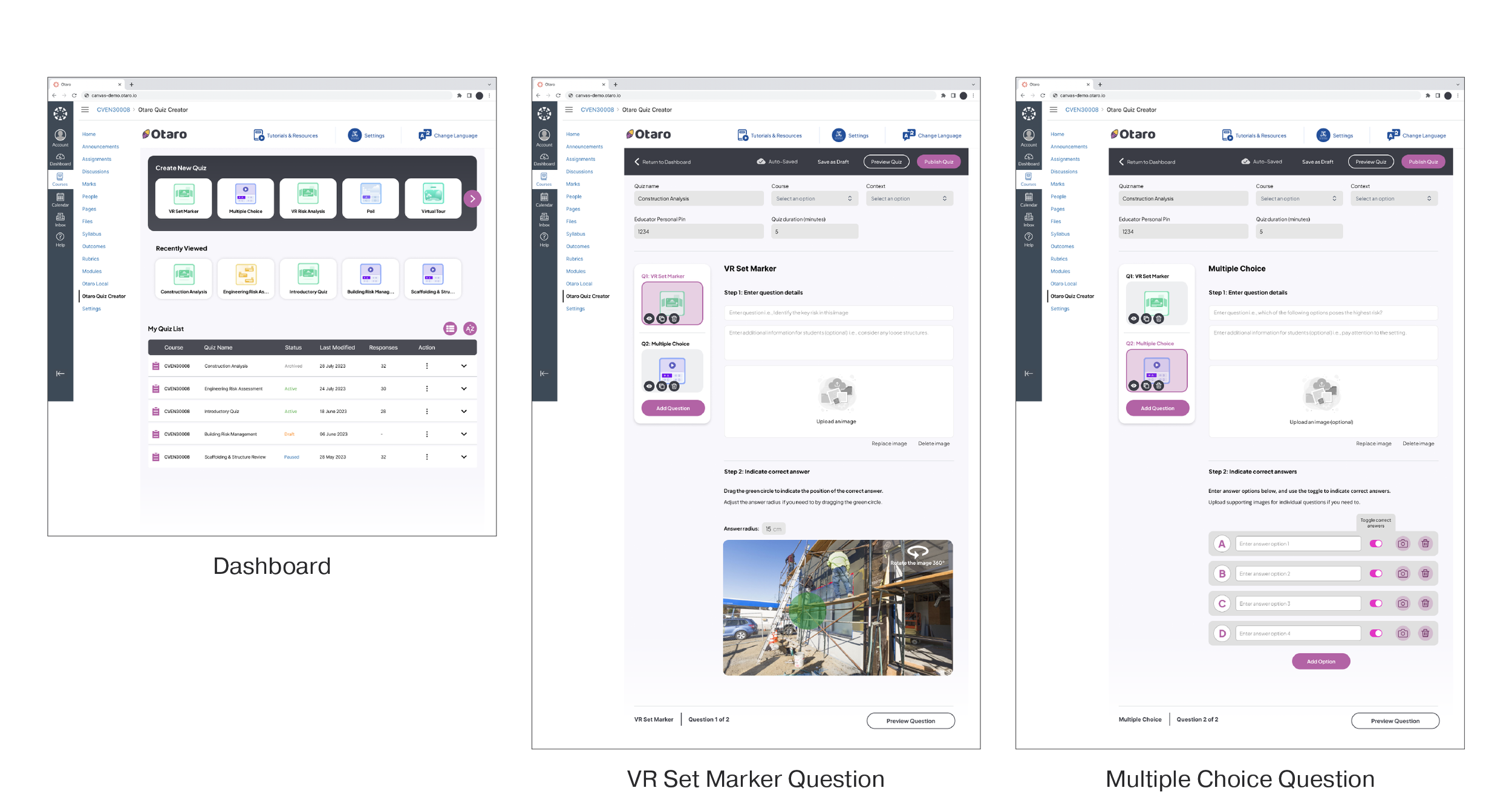
FINAL PROTOTYPE
We refined the final prototype based on feedback gathered from high-fidelity prototype user testing sessions. I recommended the integration of Otaro's new logo and branding elements to further enhance the platform's user interface design.
Notable changes included:
‘Tutorials & Resources’ link added to the top navigation bar
‘My Quiz List’ refined with a drop-down added to include responses, quiz statistics, quiz information & actions (i.e. edit, delete, duplicate, pause, archive etc.)
‘Educator Pin’ and ‘Quiz Duration’ inputs added to the basic quiz info section (can also be edited in the ‘My Quiz List’ dashboard drop-down)
‘Auto-Save’ icon to indicate that progress is being actively saved
‘Save as Draft’ option as opposed to having to finish creating a quiz in one sitting (this will then appear on the dashboard in ‘My Quiz List’ as ‘Draft’)
Information at the bottom of the page indicating question style, question number & ‘Preview Question’ option for easy access
Example of text inputs within text fields when creating a question
Further Recommendations
Add an option to import data from Microsoft Word or Excel to create quizzes
Provide first-time users with an onboarding guide and a help section that includes videos and tutorials
Allow users to rearrange quiz questions via drag-and-drop
AI integration to recommend quizzes and quiz questions to users
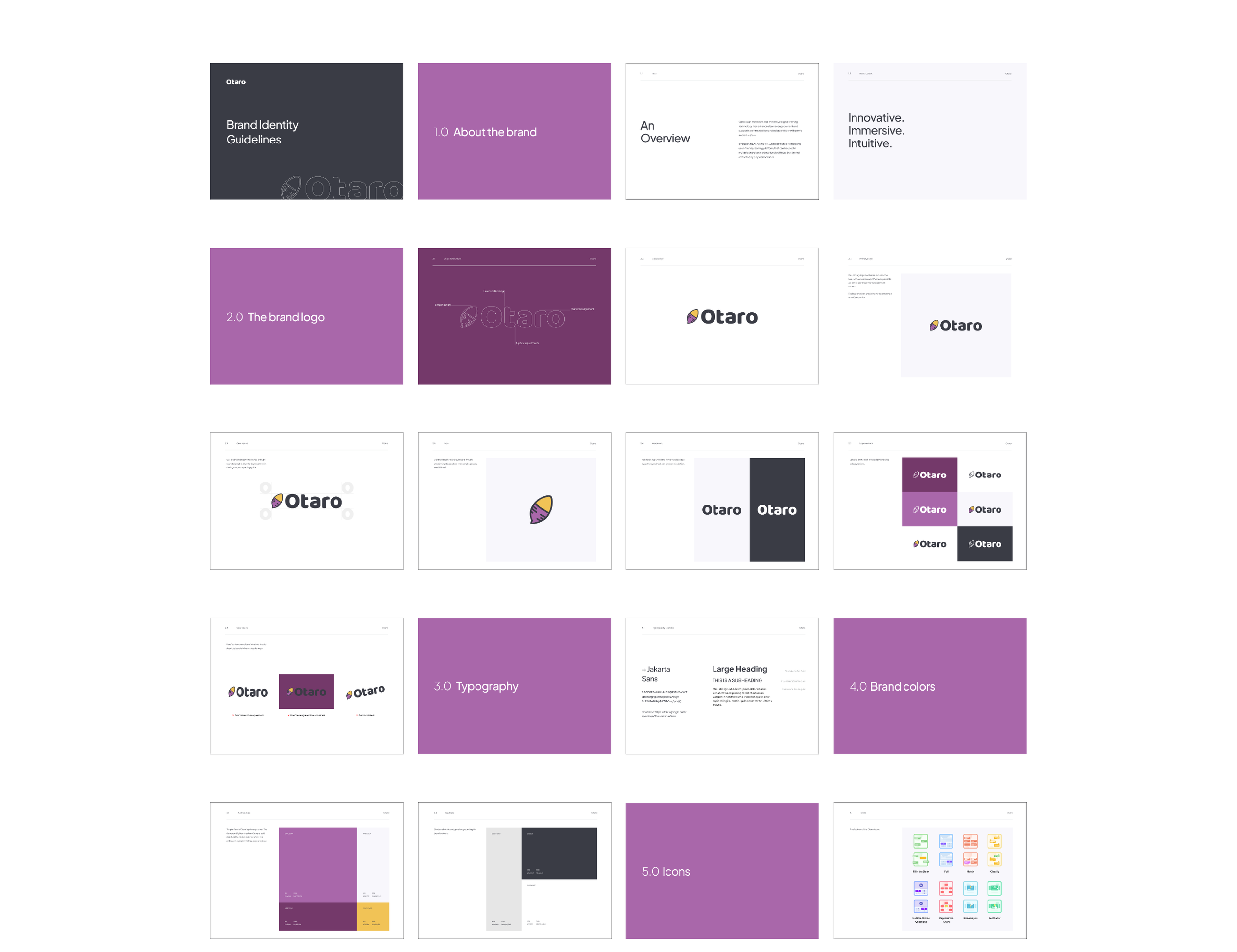
BRAND GUIDELINE
The branding document was a key deliverable for the project, and I assumed responsibility for this aspect. It encompassed essential brand identity principles, covering brand values, typography, brand colours, and iconography. I made the following suggestions:
‘Innovative, Immersive and Intuitive’ as brand values, based on words used by the client and users in interviews
Refinements to the logo, which included reducing the number of colours and fixing up the alignment and kerning
A new font to make the platform look less ‘out-of-the-box’
The aim of the guide is to provide effective communication of the Otaro brand to stakeholders in future branding efforts.
THE LEARNINGS
Asking the Right Questions (No Pun Intended)
When we received the project brief, the suggested deliverable was for a branding document. We didn't have access to the Otaro platform, so the UX deliverables were vague. In the initial client interview, we quickly discovered that Otaro needed a UX report of their existing platform and basic UI branding guidelines (i.e., logo, font and colour guidelines and not an in-depth exploration of marketing messages). The experience highlighted the importance of asking the right questions (especially probing questions) to ensure stakeholders are on the same page. It reduced our workload around the brand component and allowed us to focus on enhancing the platform's design.