Instagram Reels
Reels is a feature on Instagram that lets users create and share short-form video content. However, users often edit videos outside of Instagram on third-party apps such as CapCut and InShot. Throughout this study, we explore how the in-app editor could be improved for Creators.
Interestingly, the timeline of this study aligns with an update introduced by Instagram to its Reels in-app editor.
Project Objectives
Conduct user research to understand the current workflow for creating short-form video content
Design a more intuitive and user-friendly interface that offers a smoother editing experience
Timeline, Team & TOOLS
Twelve weeks
Solo project
Figma, Adobe Illustrator, Adobe Photoshop, Zoom
My Role
UX Research, UX Design, UI Design
THE PROBLEM
Reel-ity Check
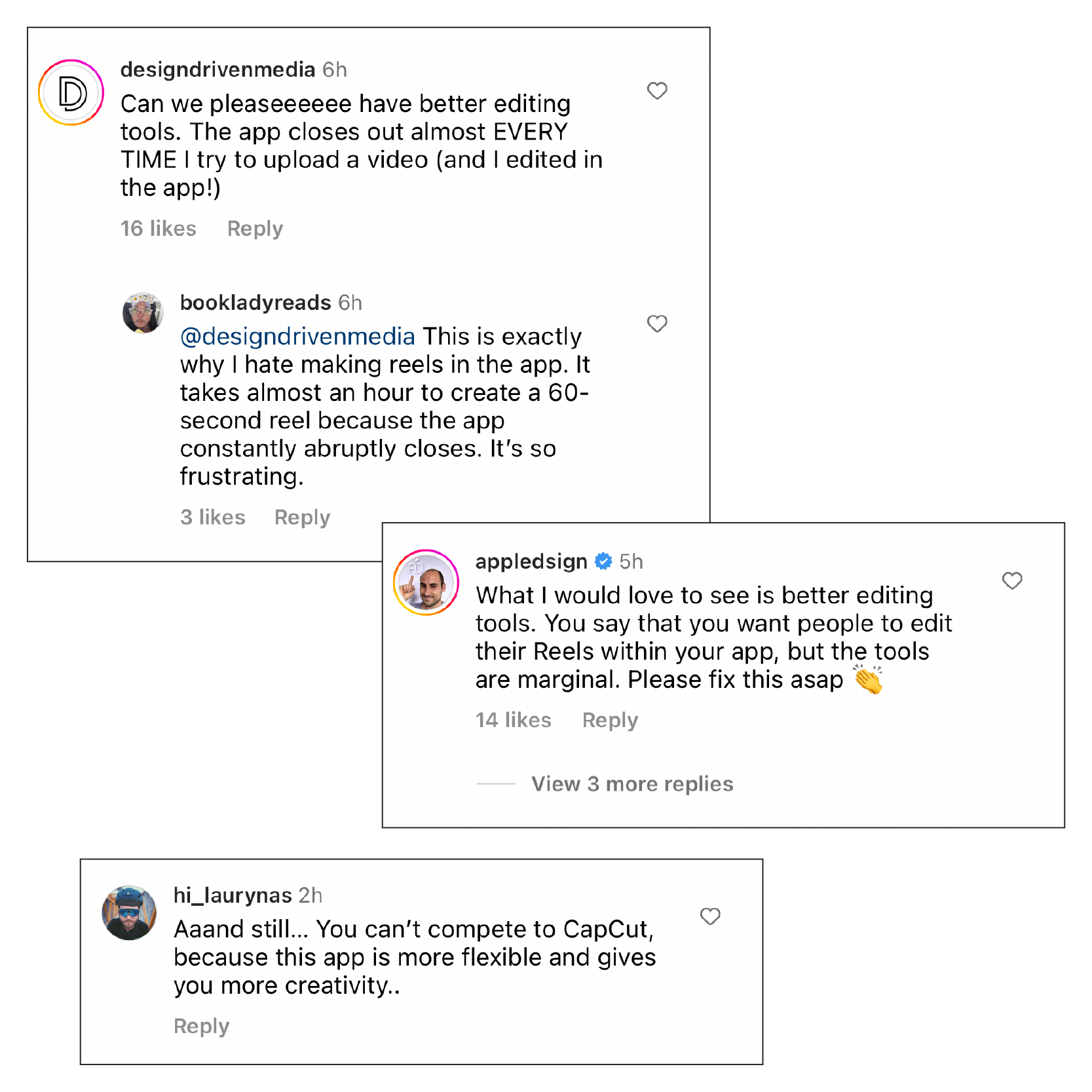
Short-form videos have taken over Instagram, with Reels now accounting for nearly 50% of time spent on the app.* Instagram prioritises Reels that use their editing tools rather than videos created by a third-party app, especially watermarked TikTok videos. However, if you search any comment thread on this topic, you'll find many people complaining about the clunkiness of the Instagram Reels in-app editor. Users accustomed to Instagram being a photo-sharing app can also find video creation intimidating.
Problem Statement
Instagram users who feel overwhelmed by video editing want easy-to-use creator tools. Users are editing Reels outside of Instagram on apps such as CapCut and InShot, creating extra friction with content creation process. E.g. Reels de-syncing audio.
*Adam Mosseri, Head of Instagram interview on ‘20VC with Harry Stebbings’
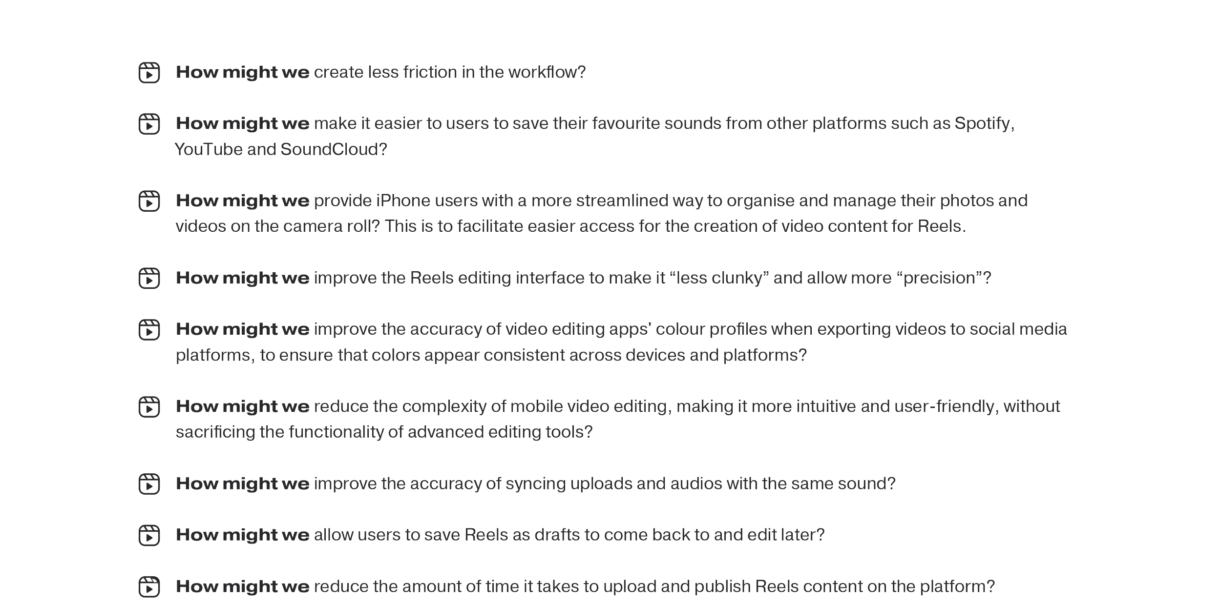
How might we reduce the complexity of mobile video editing, making it more intuitive and user-friendly without sacrificing the functionality of advanced editing tools?
THE SOLUTION
Reeling in Smooth EditS
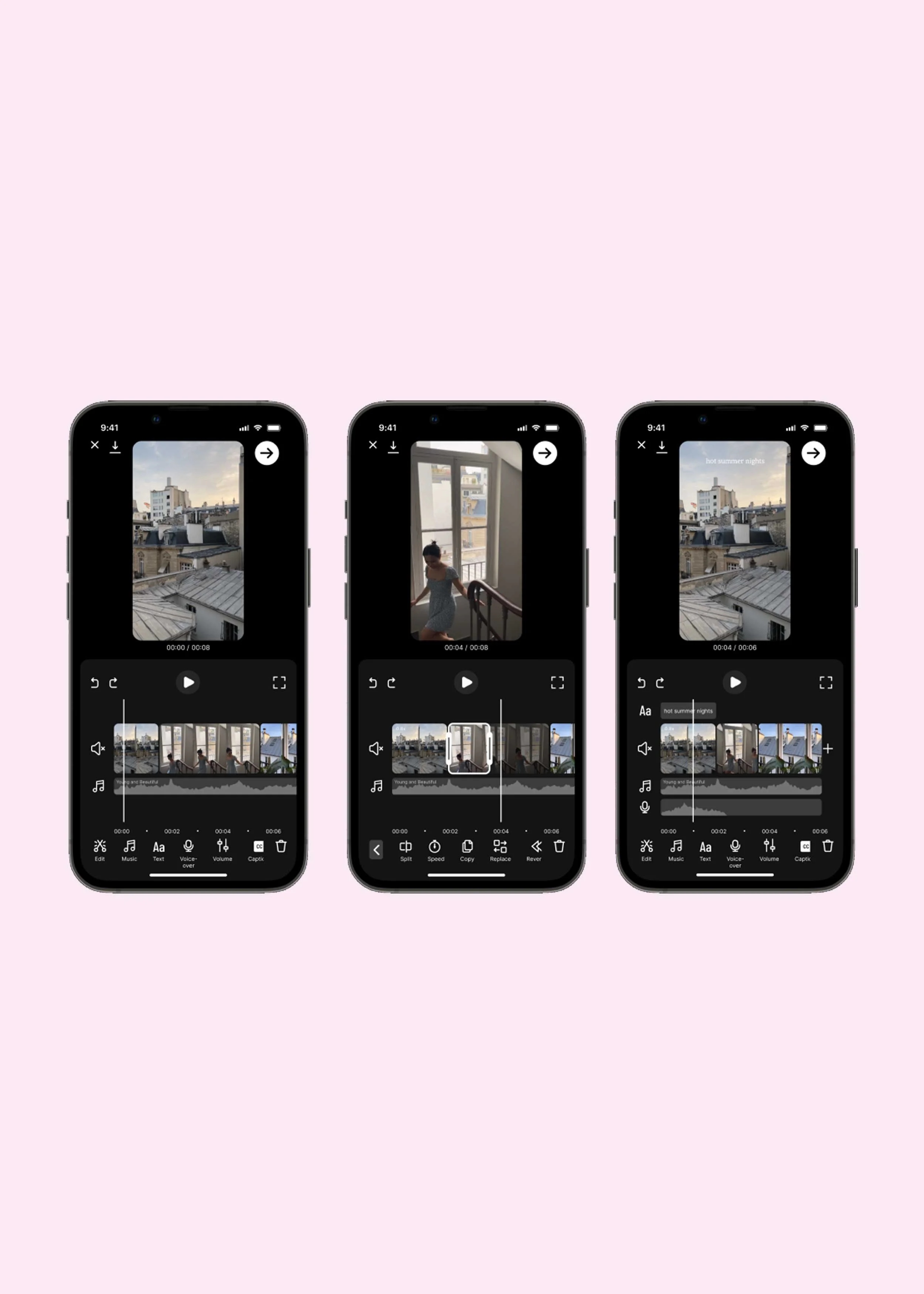
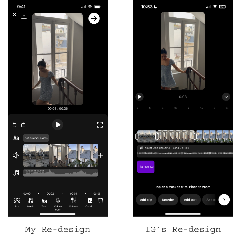
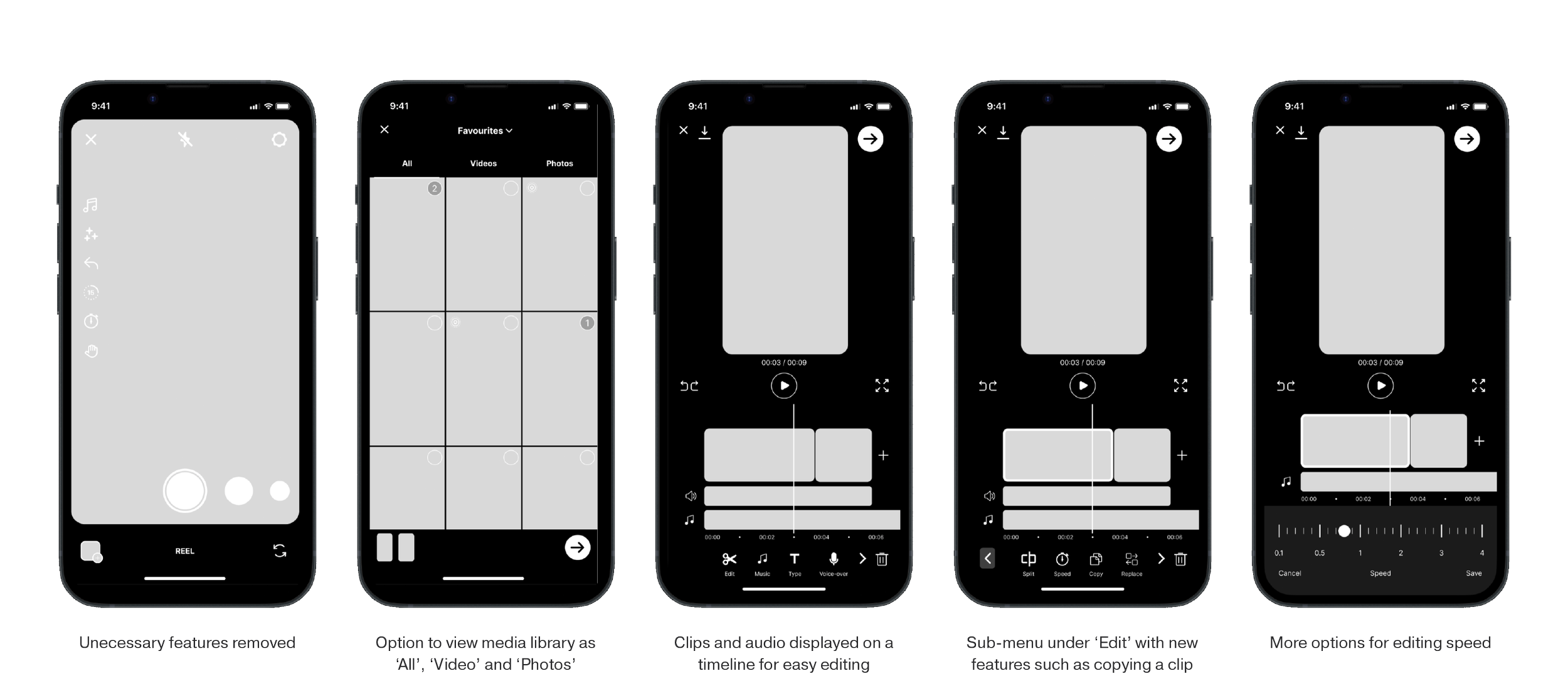
The re-design of the editor organises your video clips, music and text on a single screen with a timeline. This makes it easier to put everything in the right place and at the right time. I also added a tool called 'Sound Sync', which lets you sync your video to a song by matching the soundwaves. The feature exists for users who still prefer to edit outside the app and want to sync their video with an audio for more reach and discoverability.
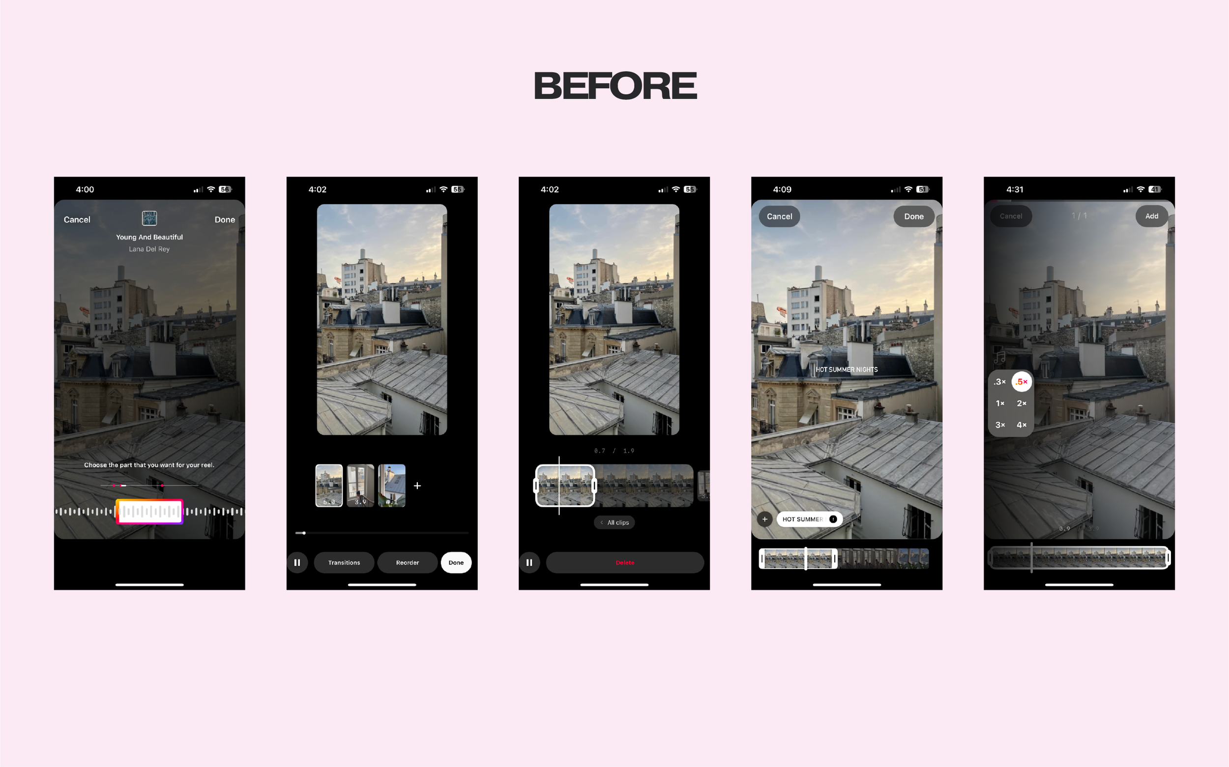
Uniform visual representation of the sound makes it hard to identify beats
No option of viewing clips on a timeline to edit in line with the music
Trimming clips requires a lot of guesswork
Trimming the duration of text also requires a lot of guess work
Limited options for adjusting the speed of a clip
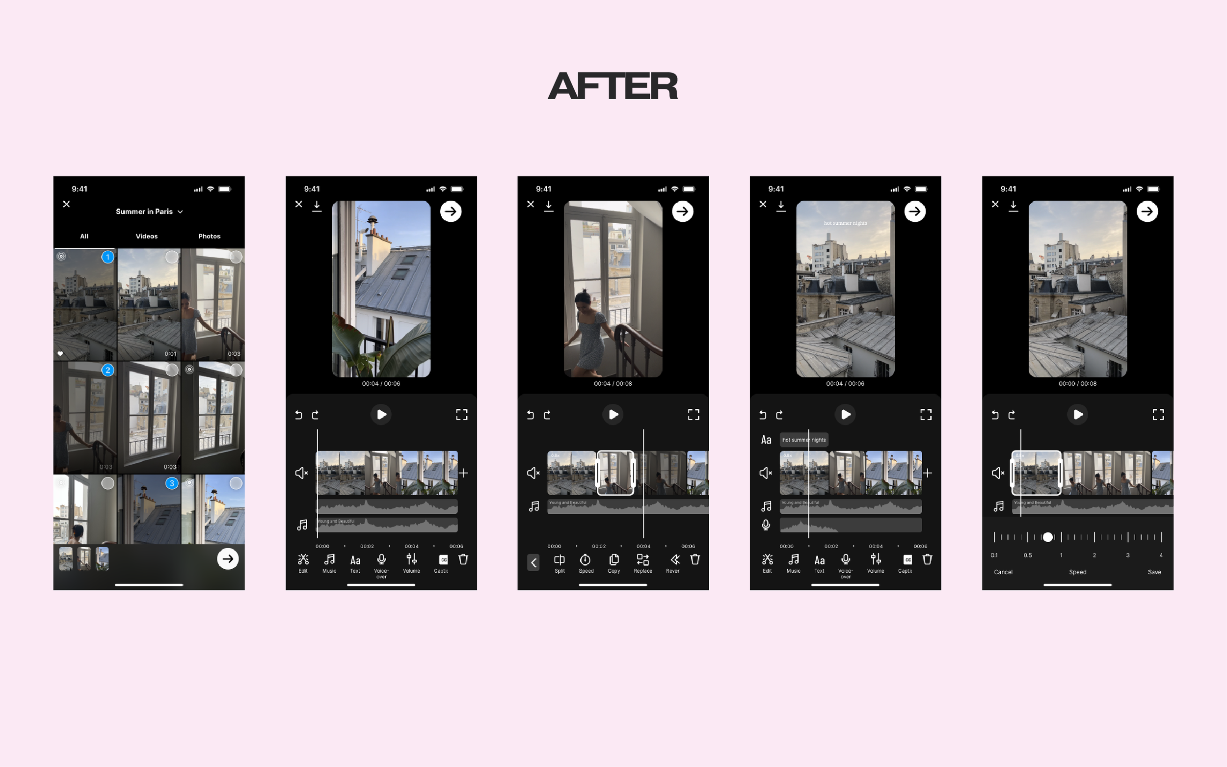
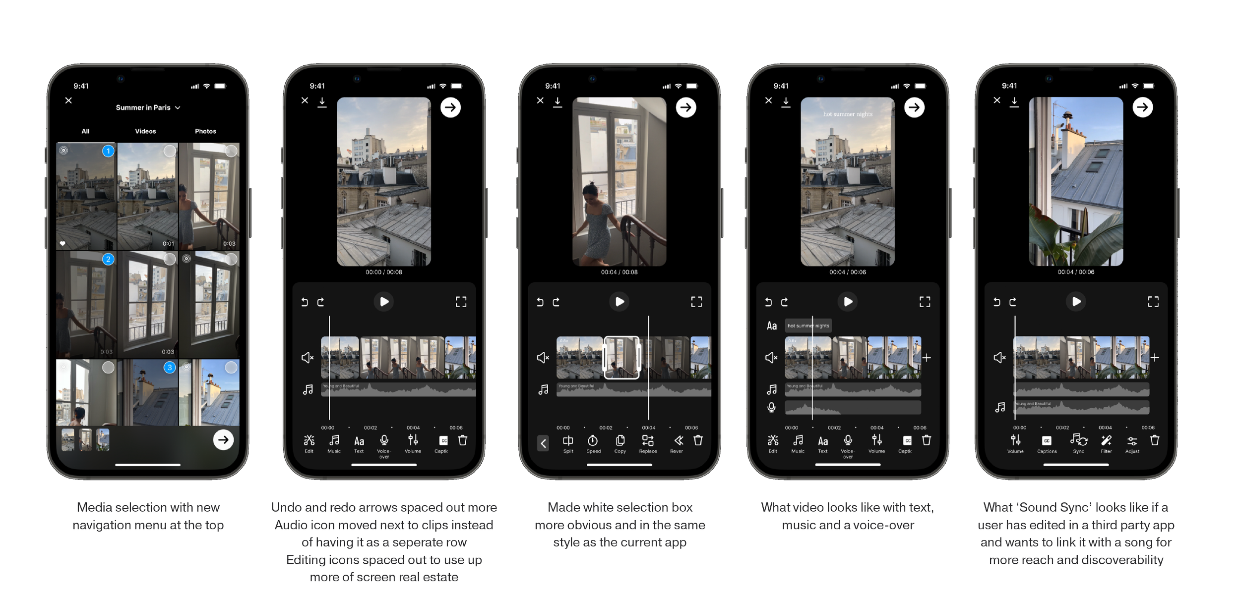
Media selection with a new navigation menu at the top
What ‘Sound Sync’ looks like if a user has edited in a third-party app and wants to link it with a song for more reach and discoverability
Trimming clips made easier with a timeline and visual representation of the sound
Trimming of text is also made easier with a consolidated editing screen
More control over adjusting the speed of a clip
now that’s a meta-match
Notably, the new editor Instagram rolled out followed a similar timeline-based approach. The main difference was their use of text instead of icons for the editing tools.
THE PROCESS
DISCOVER
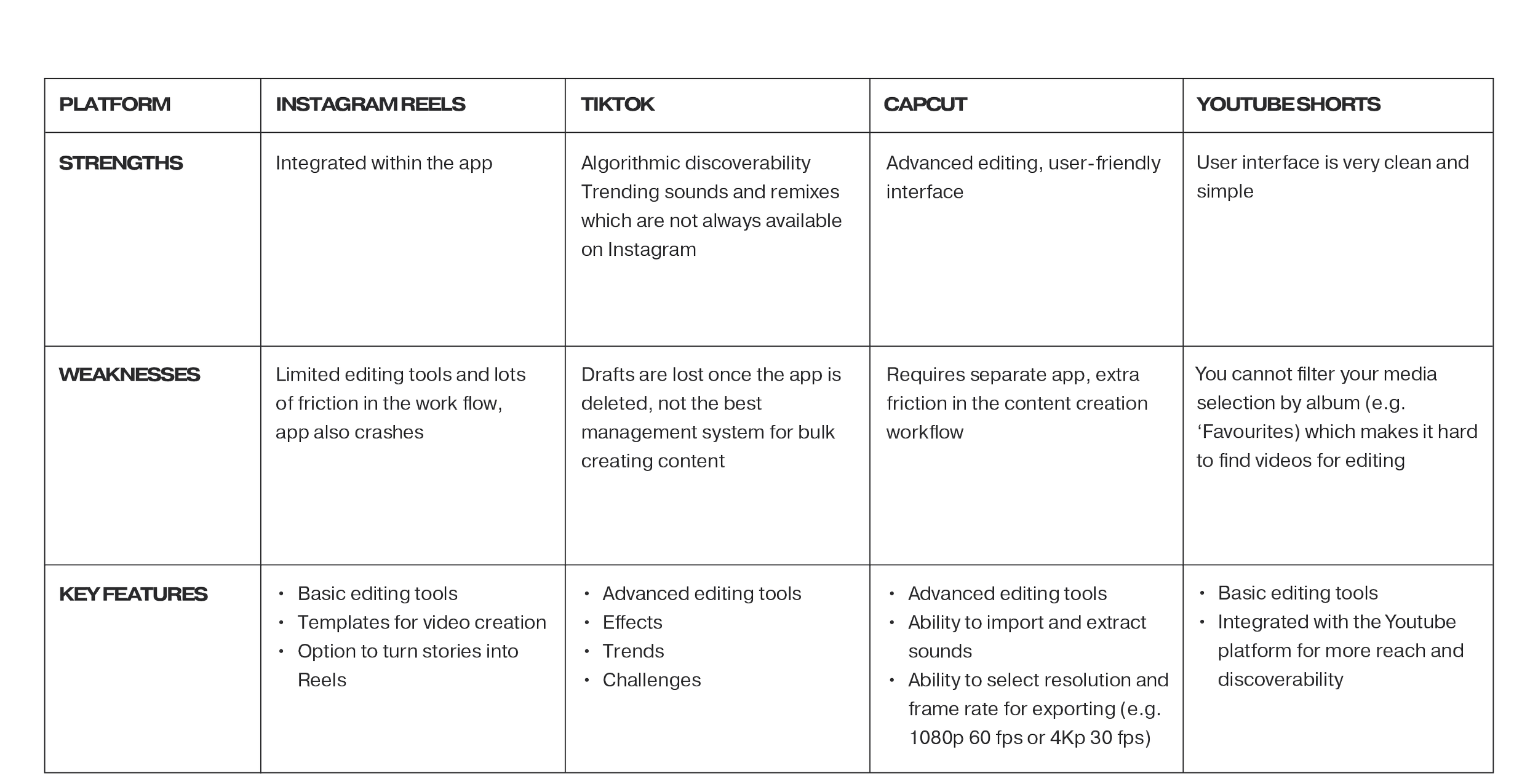
COMPETITOR ANALYSIS
I conducted a competitor analysis of the key platforms for editing and publishing short-form video content. They included:
TikTok
CapCut
YouTube Shorts
TikTok and CapCut are owned by the same parent company, Byte Dance and both have advanced editing tools in comparison to Instagram Reels. Additionally, I also examined InShot, VideoLeap, Adobe Premiere Pro, DaVinci Resolve, and Canva, as they were mentioned in my one-on-one interviews.
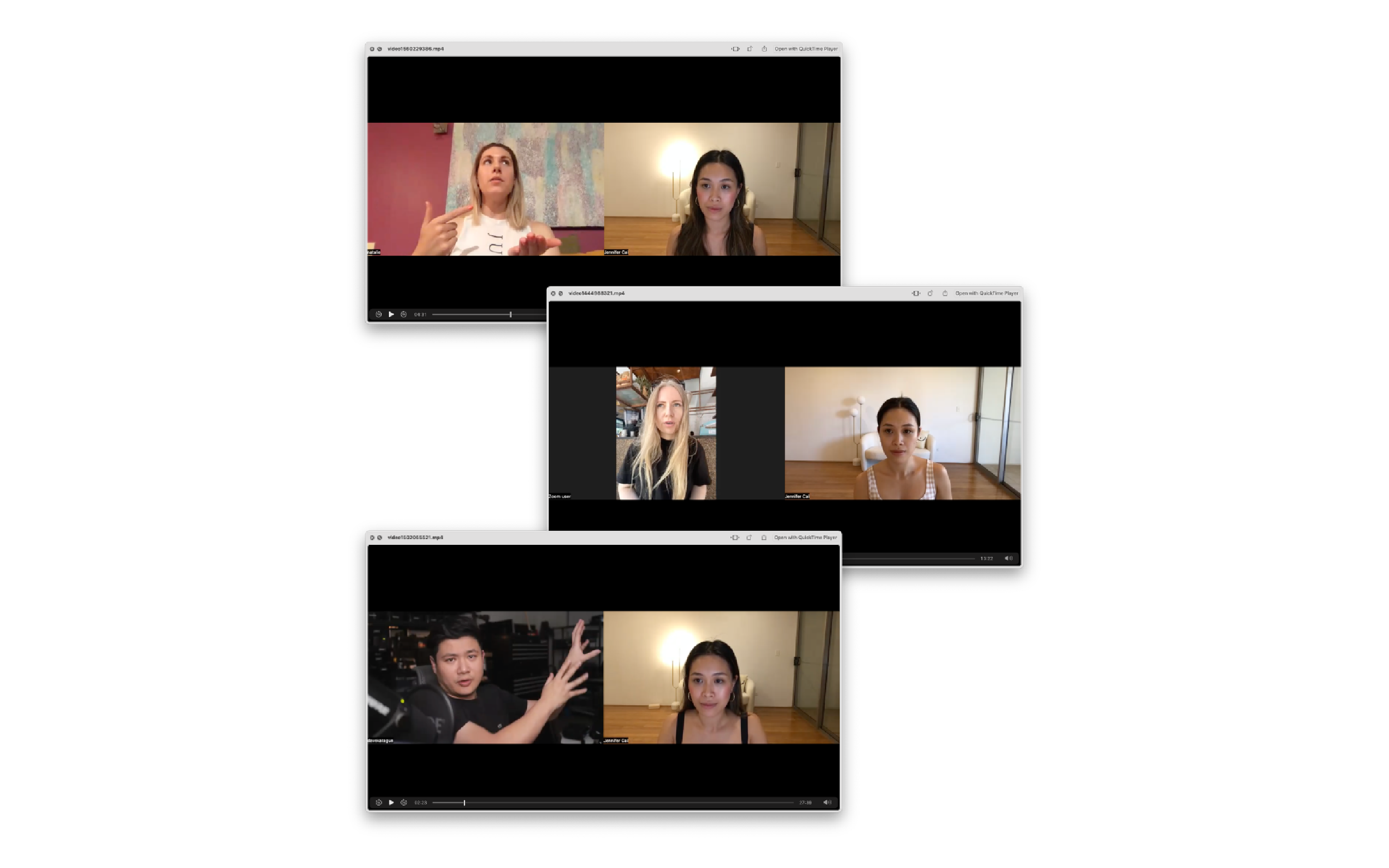
ONE-ON-ONE INTERVIEWS
I conducted a total of six interviews — the interviewees consisted of two everyday users, two content creators, and two professional videographers. For the interviews, I utilised a framework of five questions from Cindy Alvarez's book, ‘Lean Customer Development’.
Interview Questions
Please describe how you currently approach the task of ___.
Are there any tools, products, apps, or tricks that you use to assist you in accomplishing ___?
If you had the power to do anything related to ___ that is currently not possible, what would it be? Feel free to think without limitations.
Before starting ___ the last time, what were you doing? And after finishing, what did you do?
Is there any additional aspect related to ___ that I should have inquired about?
Key Insights
My hypothesis was confirmed during the interviews, as five out of six participants reported that they edited their videos using a third-party app because they found the Instagram editing tool to be "clunky". Additionally, I discovered that the majority of users began the editing process by selecting the music they wanted to use.
DEFINE
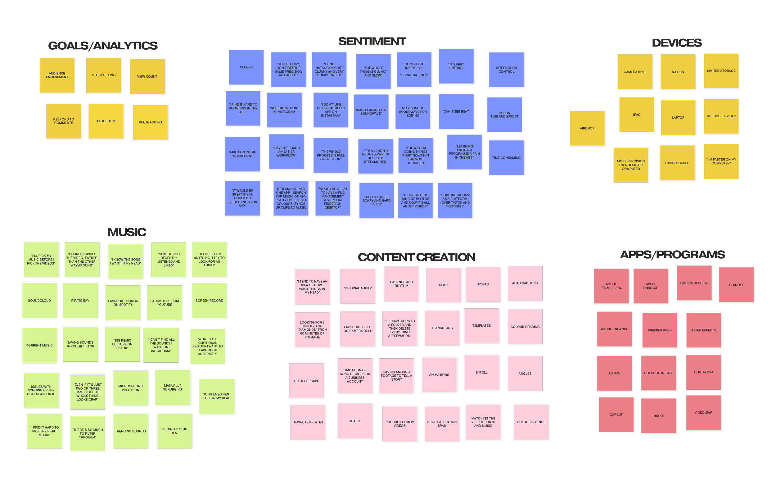
AFFINITY MAP
I organised my finding from the one-on-one interviews into an affinity map. When it came to sentiment, I found that the word “clunky” came up repetitively:
“Too clunky, don’t get the same precision as CapCut”
“I find Instagram quite clunky and very complicated”
“The whole thing is clunky and slow”
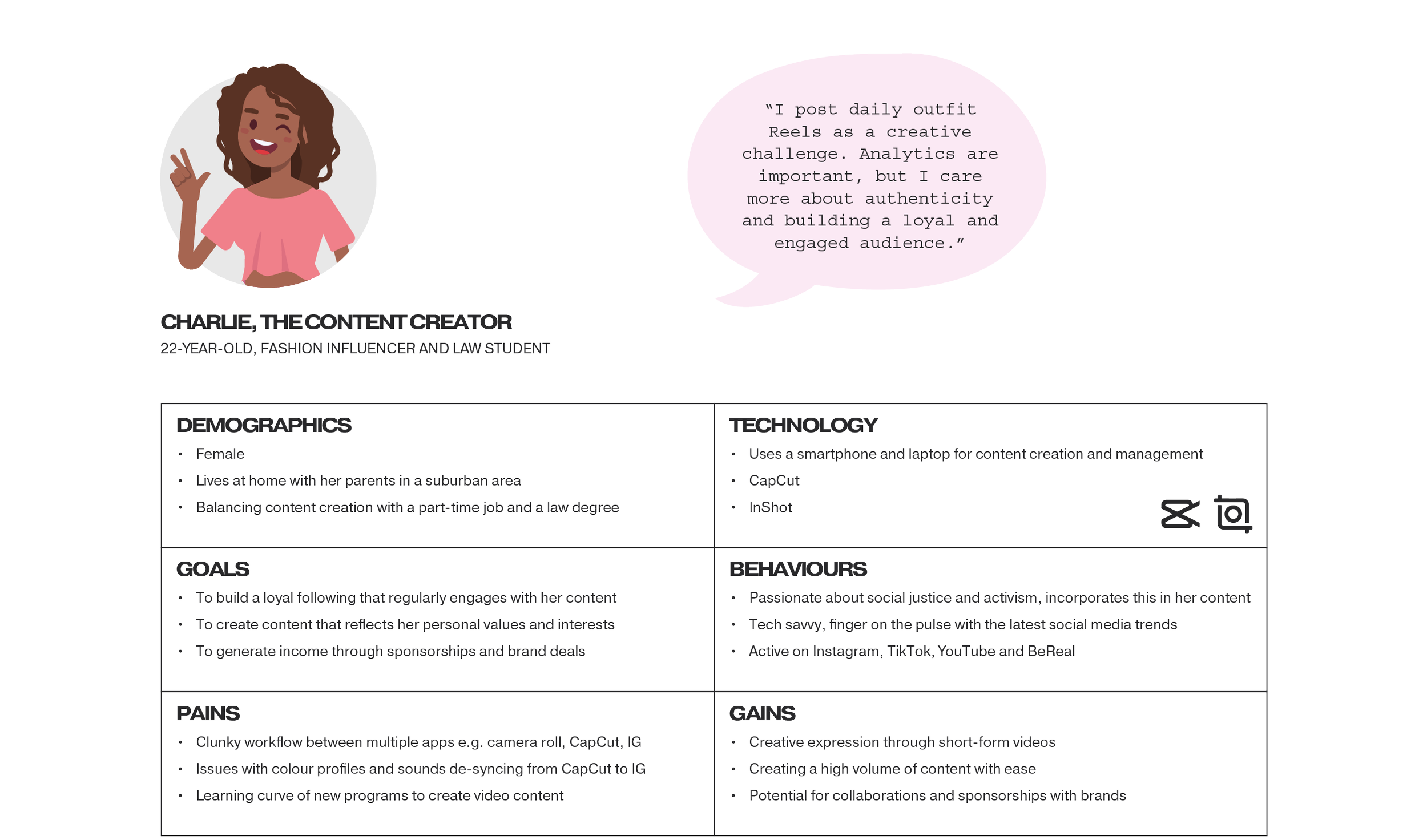
PERSONA
Although I interviewed three persona types (the everyday user, the content creator and the creative professional), I narrowed it down to problem-solving just for one because each group has different needs. The content creators are the super users of this feature, so it made the most sense to design for them.
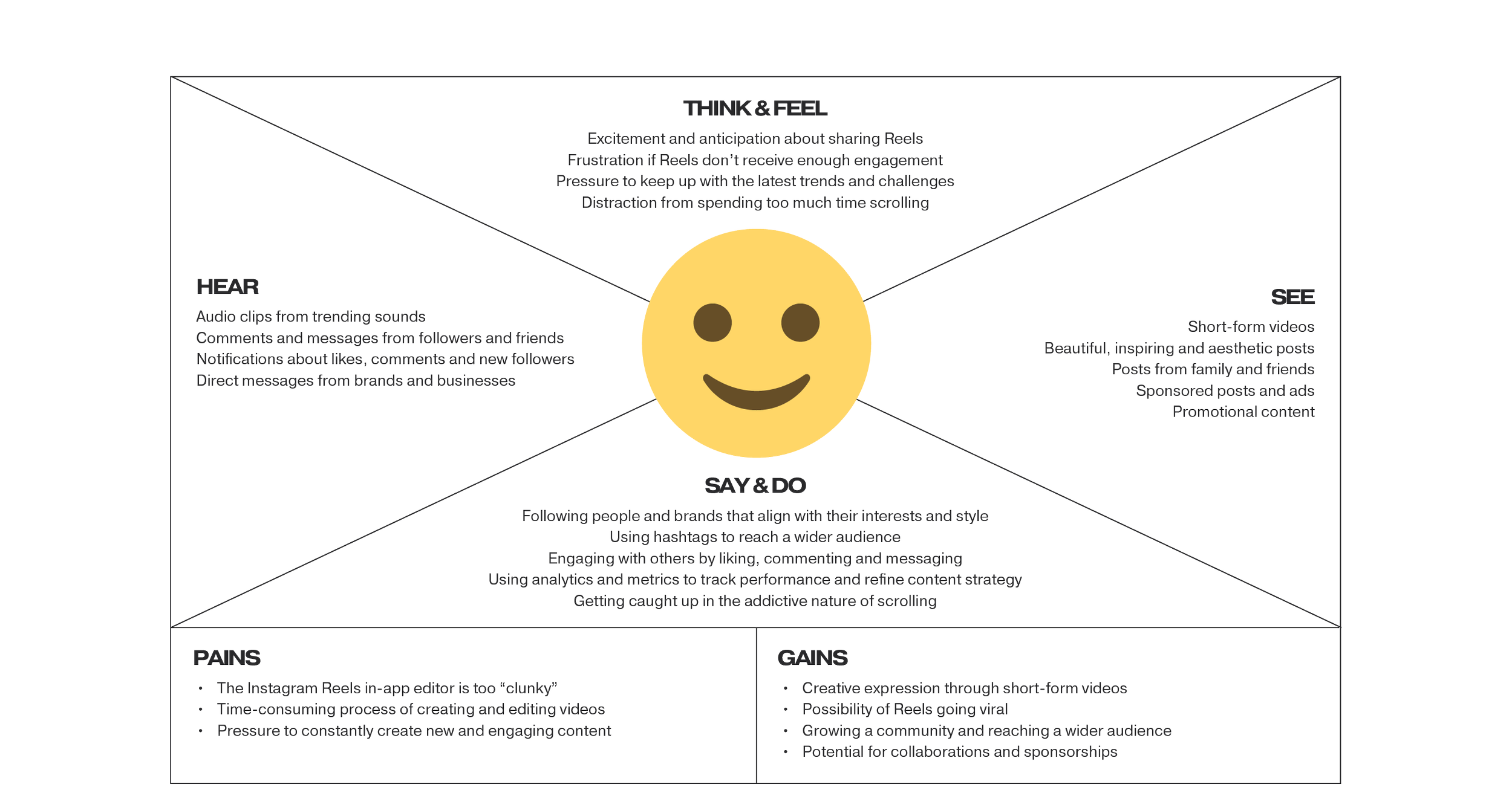
EMPATHY MAP
I created an empathy map for ‘Charlie, the Content Creator’. Charlie is a micro influencer with a niche account. She needs to constantly create new and engaging content, and currently edits her Reels on a third-party app and imports into Instagram.
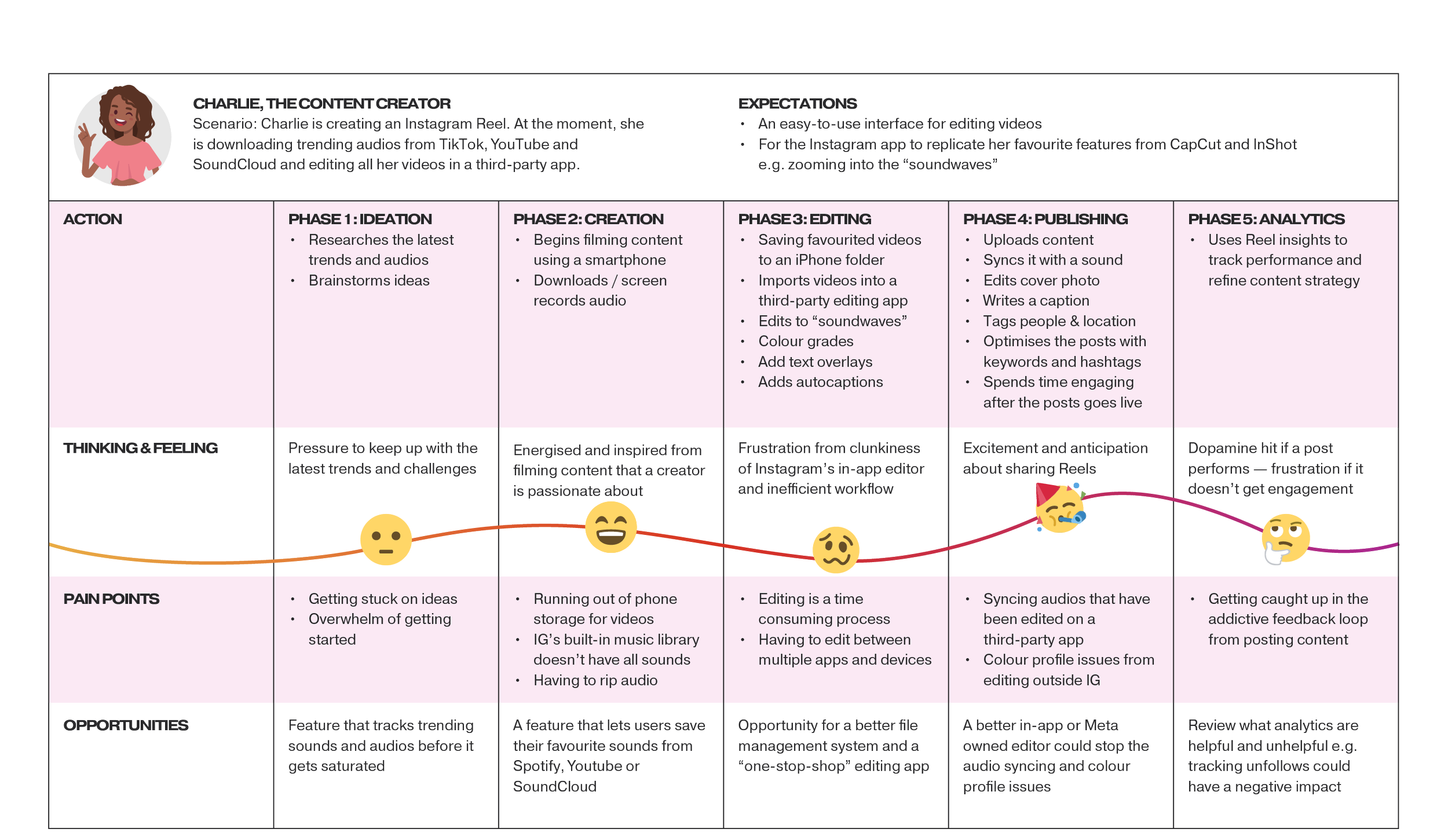
JOURNEY MAP
In this journey map, Charlie is creating an Instagram Reel. At the moment, she is downloading trending audios from TikTok, Youtube and SoundCloud and editing all her videos in a third-party app. She expects an easy-to-use interface for editing videos, and wants the Instagram app to replicate her favourite features from CapCut and InShot. e.g. zooming into the “soundwaves”
DEVELOP
HOW MIGHT WE
I developed a number of How Might We (HMW) statements that addressed user pain points. The problems were framed as open-ended questions to encourage creative thinking and brainstorming.
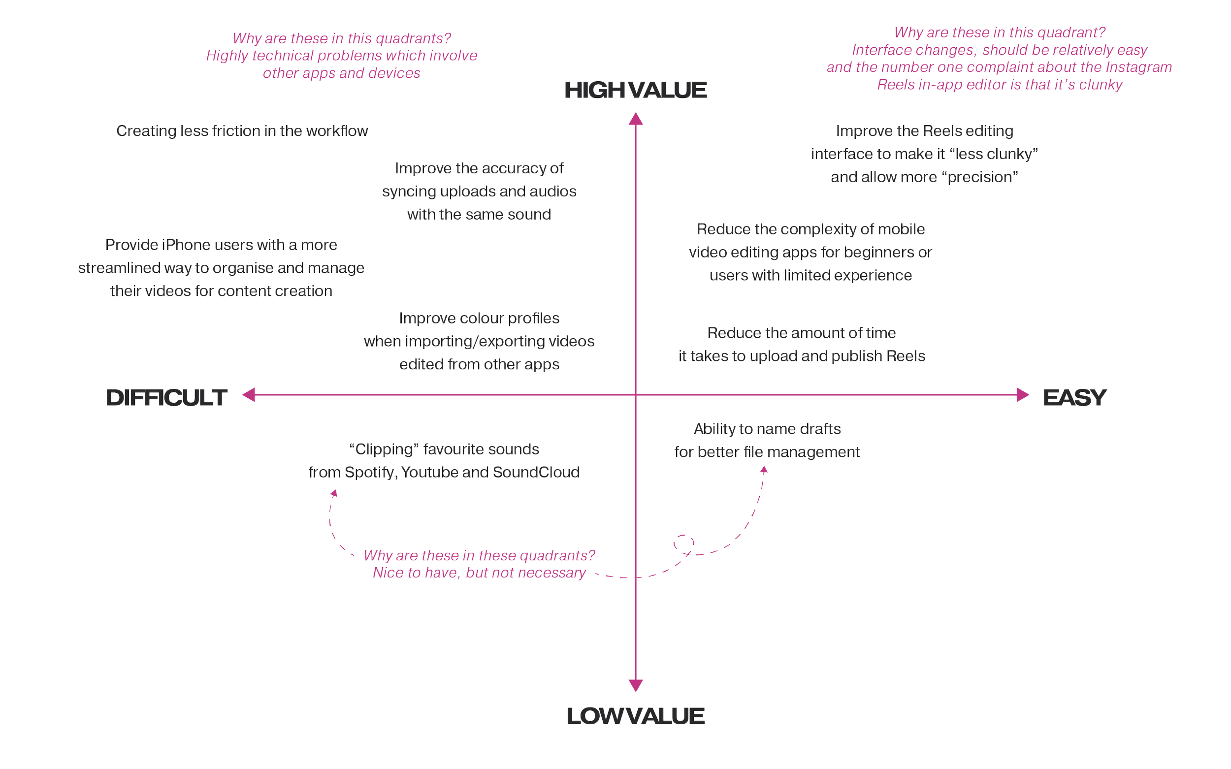
PRIORITISATION MATRIX
After brainstorming design solutions, I organised ideas on a prioritisation matrix along high-to-low value and difficult-to-easy axis points. The quick wins in the high-value and easy quadrant were mainly around the interface changes.
STORYBOARD
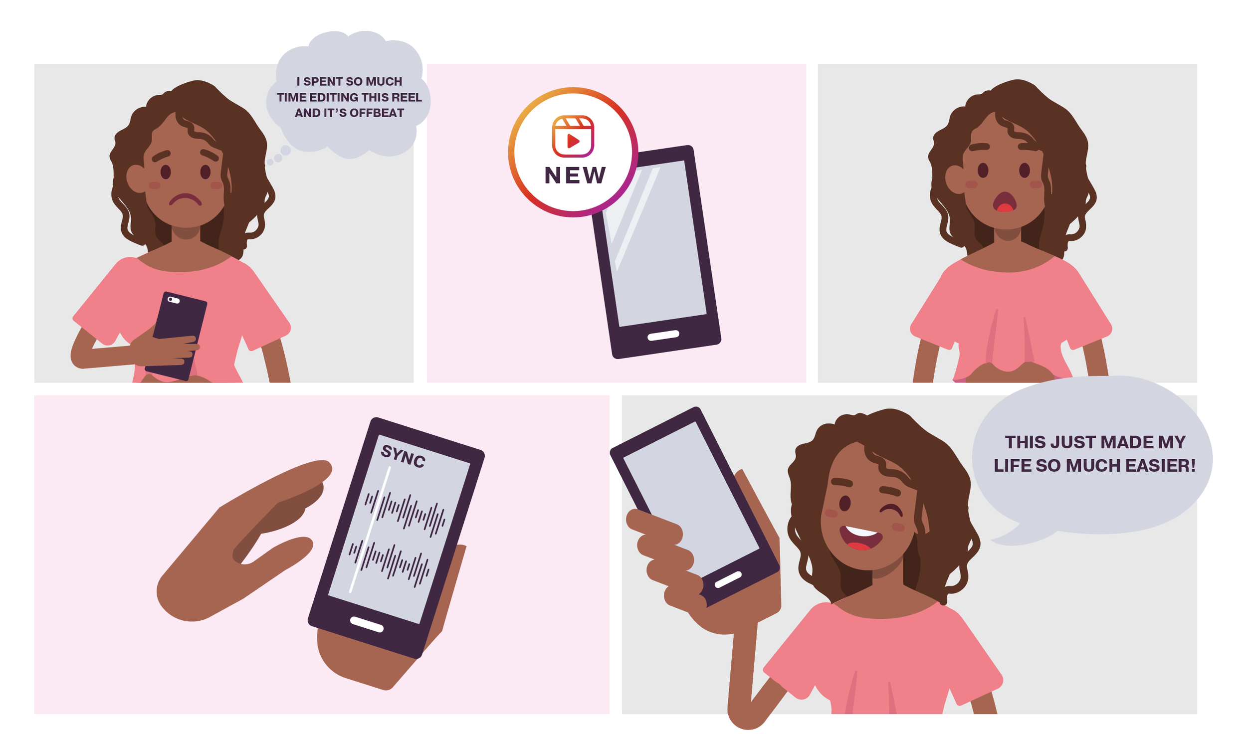
Drawing upon one of the Crazy 8 ideas, I created a storyboard to illustrate the user experience. In this scenario, Charlie has edited her Reel using a third-party app and has trouble syncing the sounds when she uploads the video back onto Instagram. The ‘Sound Sync’ feature now does this automatically for her by matching up the visual representation of the soundwaves.
CRAZY 8’S
Eight ideas for improvements from a fast sketching and brainstorming exercise.

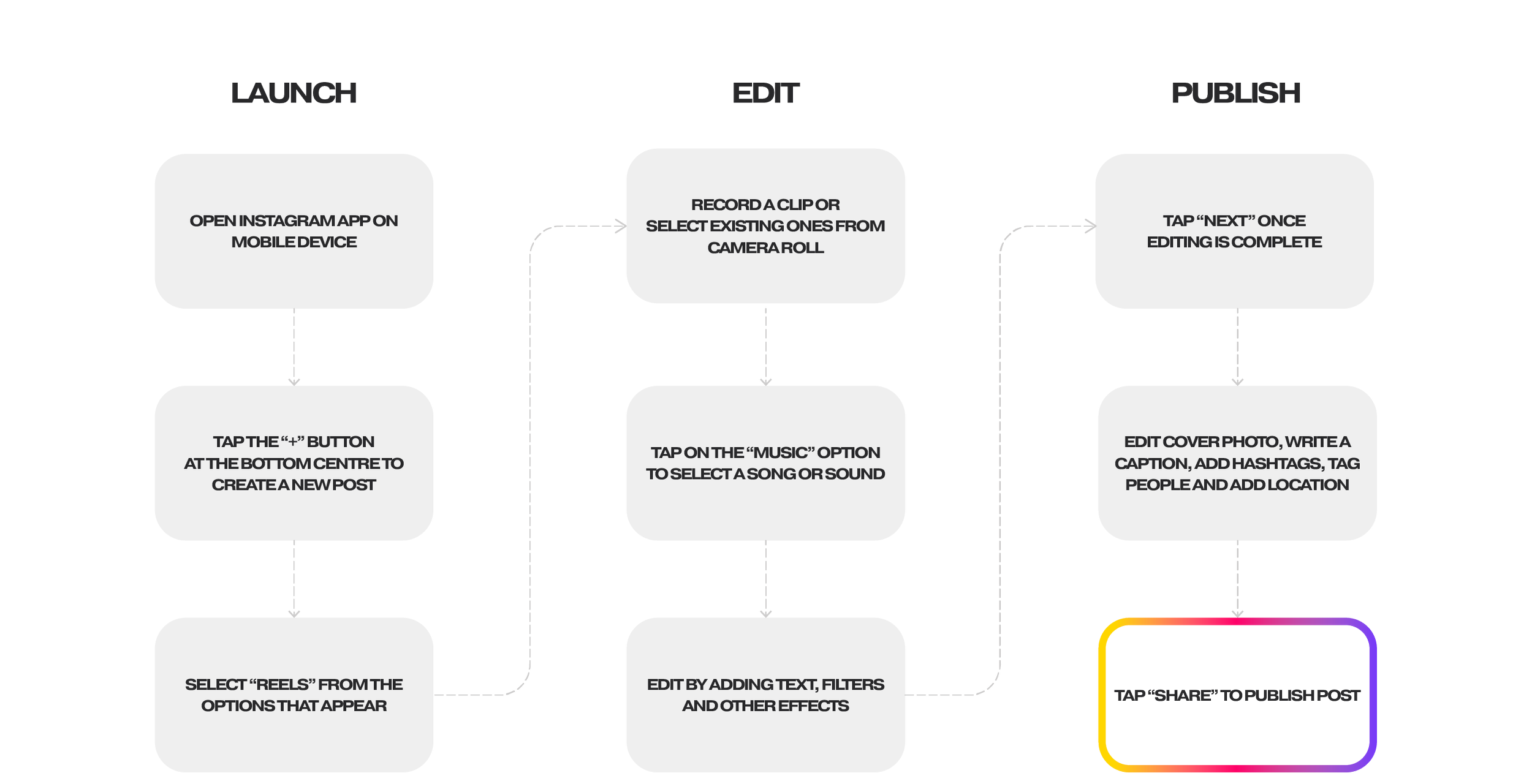
current USER FLOW
The current user flow to launch, edit and publish a Reel.
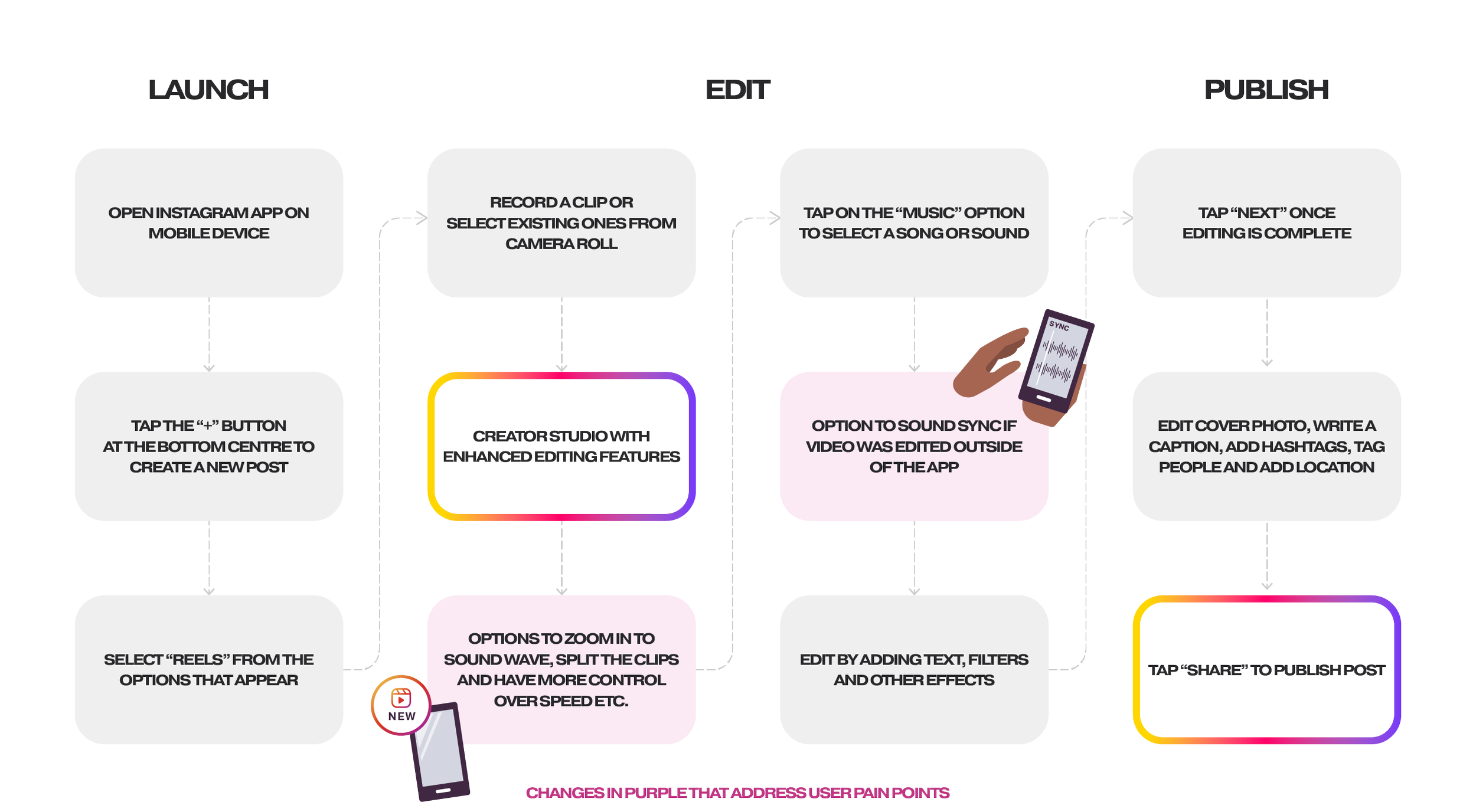
REVISED USER FLOW
In the revised user flow, a creator studio with enhanced editing features is added. The changes in purple address the main pain points by giving users:
More editing control with the option to zoom into a soundwave, split the clips and more options for adjusting the speed etc.
The option to sound sync if a video was edited outside of the app
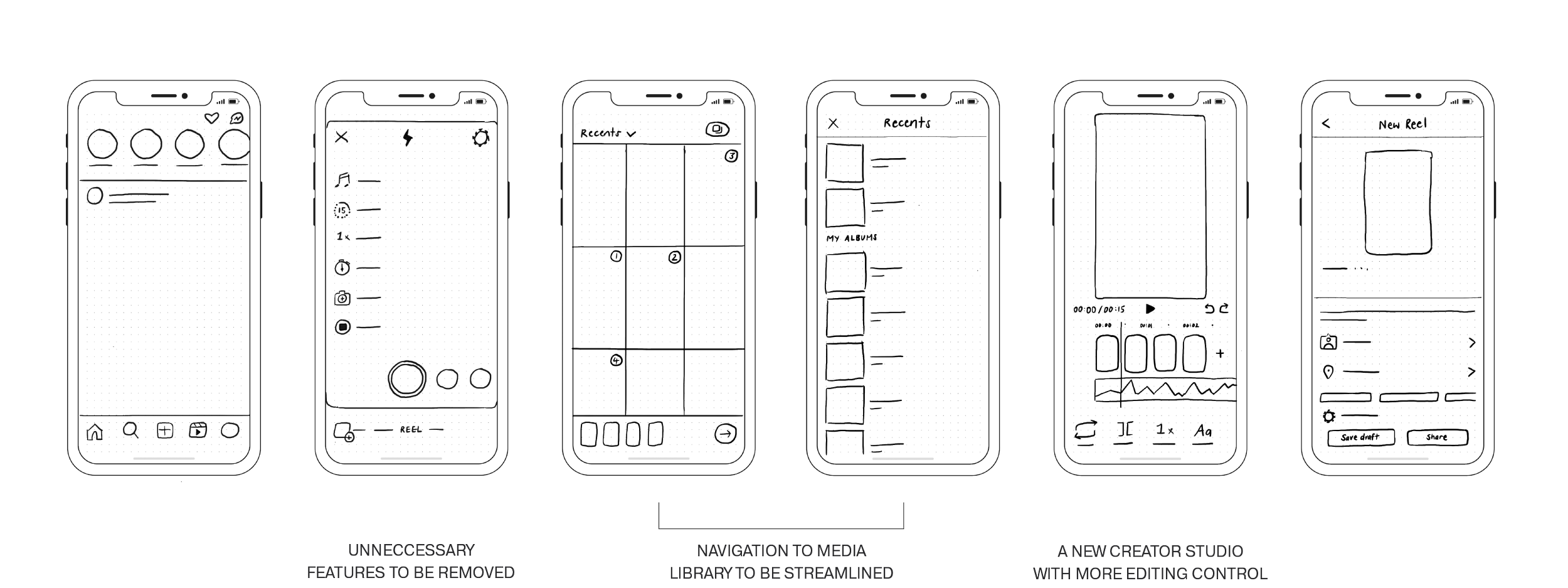
LOW-FIDELITY WIREFRAMES
Low-fidelity wireframes of the revised user flow with the following changes:
Unneccessary features to be removed
Navigation of the media library to be streamlined
A new creator studio with more editing control
BRAND GUIDELINES
Instagram is an existing brand, so I worked within their brand guidelines for the UI design. I also studied their existing design language to ensure the consistency of things such as icons and typography.
Instagram’s brand identity guidelines can be found here.
deliver
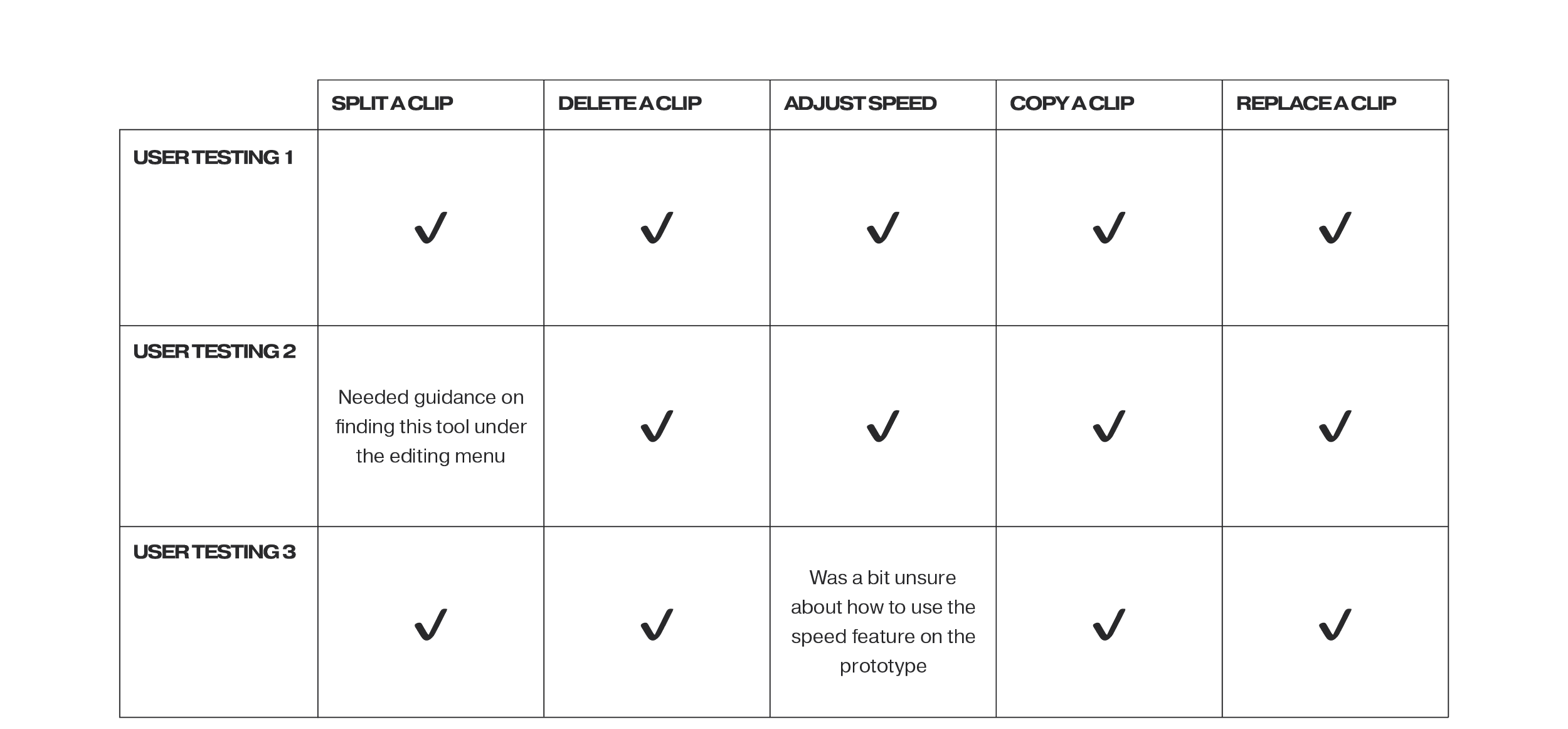
USER TESTING (mid-fidelity prototype)
I created a mid-fidelity prototype in Figma for user testing and conducted ‘Think Aloud’ testing over Zoom. During the testing session, users were instructed to share their actions, thoughts, and emotions while interacting with the prototype.
Testing Tasks
To assess the editing features (the primary focus of my project), I assigned the following tasks to the users:
Split a clip
Delete a clip
Adjust the speed of a clip
Copy a clip
Replace a clip
Additionally, I requested the users to provide ‘Think Aloud’ feedback while exploring the existing text, voice-over, and publishing features.
Key Insights
Some users expressed confusion regarding the undo and redo arrows due to the close spacing between them. They suggested increasing the spacing to make their functions clearer.
Users also expressed a desire for more obvious indicators when selecting a clip. They felt that the current selection method was not obvious enough.
Another point of feedback was that users found it counterintuitive that the play button in Instagram's existing interface is located in the bottom left-hand corner rather than the centre of the screen. They suggested reconsidering its placement for improved user experience.
HIGH-FIDELITY PROTOTYPE
I then refined the final prototype with revisions from user testing. All icons were also re-drawn to match Instagram’s current UI.
THE LEARNINGS
Don't just scroll through life, back yourself
While working on my UX case study about Reels, I discovered a surprising piece of news: Instagram was also planning to update the Reels editor. At first, I was worried that my findings might not be relevant anymore. Yet, upon further reflection, the situation reaffirmed that I can identify problems and areas for improvement. It's a lesson that no company, no matter how big, has everything figured out. And there is always room for growth.